Create a pie chart in Excel step by step And how to customize a pie chart in Excel?
➥ Go to the start of the free online Excel Course
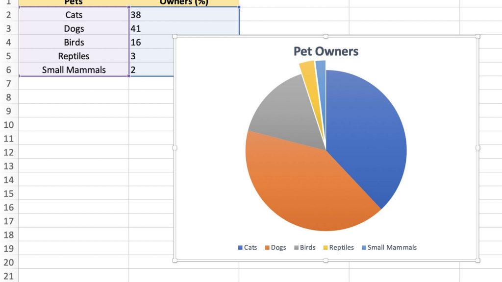
- Pie charts are one of the solutions that Microsoft gives us in Excel to show, in a more simple way, what are the percentages of individuals who meet this or that condition
- Creating pie charts in Excel is not complicated at all, and we also have the ability to edit them, thereby making them look exactly as we want in each case.
When using different Microsoft programs, there are internal elements that can enrich your files. Making a pie chart in Excel , for example, can be a good way to illustrate something you are saying. In addition, as it will only take you a few seconds to customize it, it will be just how you want it and you will make sure that everyone who is watching it will perfectly understand what your intention is with that product..
Indeed, the use of pie charts allows you to illustrate the distribution of data in the form of sectors, and it is really easy to create pie charts in 2D, 3D or donut shape in Microsoft Excel, since no great previous knowledge is needed to be happy with the results obtained in the presentation .
Pie charts can easily tell you where you spend , and thus better control your spending with Excel. They can also help you find out what percentage of the total sample meets a certain condition..
Create a pie chart in Excel step by step
- Open a spreadsheet in Excel like you normally do:
- Select the data you want for your pie chart
- With the data selected, go to Insert
- In Insert, the Charts section will appear , and you must select Insert pie or donut chart
- You'll see numerous pie chart options, but you should stick with the one you like best
- If you hover over them, you will have a series of previews to see what they would look like
- Selecting the pie chart of your liking, it will be available in the spreadsheet
- You can modify basic aspects, such as the header , by double clicking there
- If you drag it, you can modify the position of the graph , dropping it wherever you want
And how to customize a pie chart in Excel?
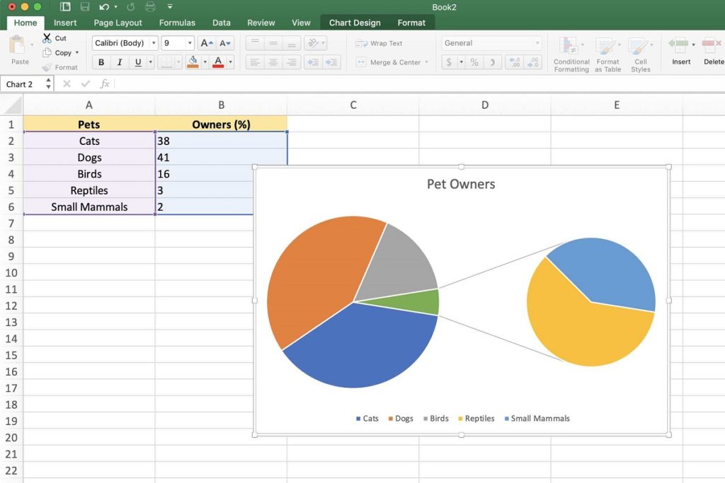
The default pie chart layout looks good on its own, but you can always customize it if you prefer. From the Graphic Design tab you have multiple alternatives to give it a different, unique touch .
You will not reach the potential of advanced charts in Excel, but you can still always change their colors, make modifications to the Chart Styles, or save the chart as if it were an image . The latter is especially interesting if, for some reason or reason, you want to use the graph later outside of Excel. All you have to do then is right click on the graphic, and Save as image ..