One of the most used applications for the subject of data management and spreadsheets, there is no doubt that it is Excellent, since this Office tool allows us to carry out a number of operations in a simple and fast way, applying its different formulas in depending on what we need..
Excel offers us a wide set of options to represent the data delivered or that we handle in a much clearer and more specific way and one of these ways is using graphics, a graph shows us a series of data in a single step allowing us to visually have Clarity about what projection you have, it is ideal in databases, statistics, sales, notes, etc.
Excel offers us various types of graphs to use but without a doubt one of the most used for its simplicity and representation and in TechnoWikis we will explain how to make graphs in Excel from the available data..
To stay up to date, remember to subscribe to our YouTube channel!
SUBSCRIBE ON YOUTUBE
How to make graphs in Excel
Step 1
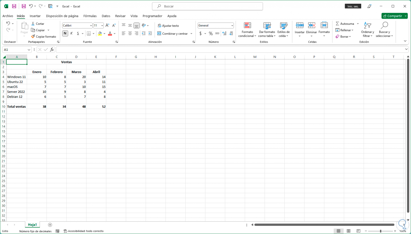
We open Excel to see the data to be graphed:
Step 2
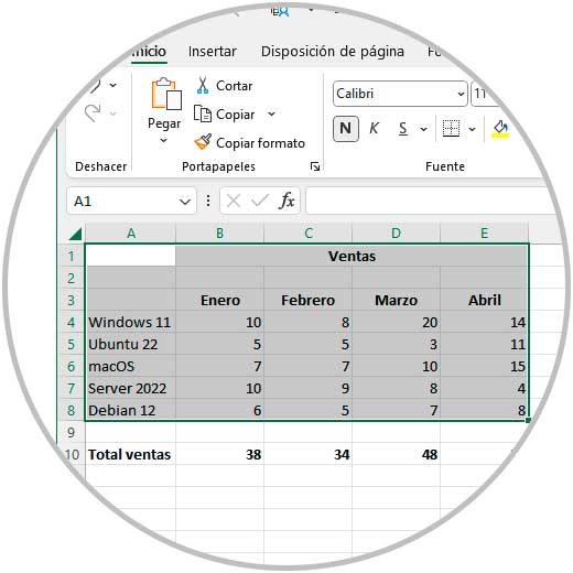
We select the range of cells to link to the Excel chart:
Step 3
It is possible from the Insert menu to select the desired type of graph but for a much simpler way, just press the Alt + F1 keys to directly open the graph in Excel with the selected data:

Step 4
There we can move the chart to the desired location within the spreadsheet:
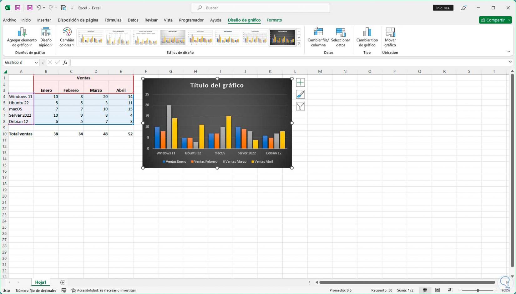
step 5
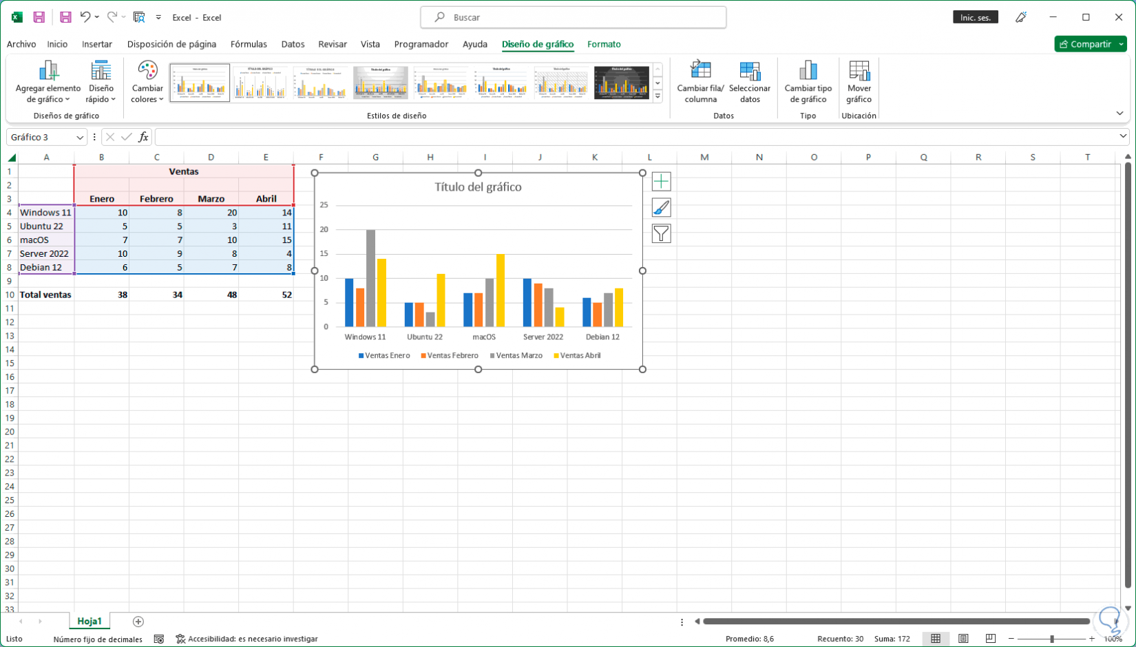
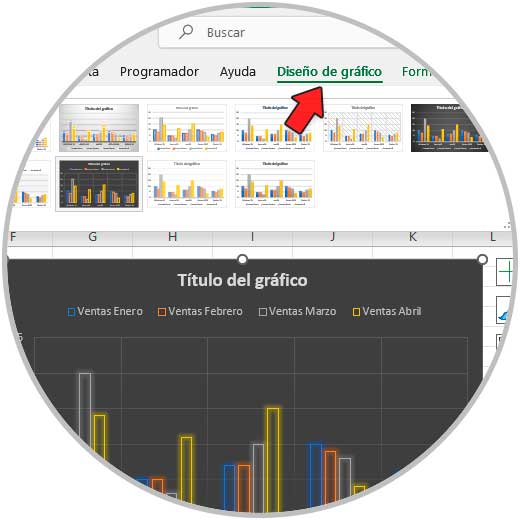
As we can see, a new menu called "Graph design" is activated, in which it will be possible to manage both the appearance and the control of the graph data, from "Design styles" we select the style of the graph to use:
step 6
It will be applied automatically when the mouse passes over each design so that we are clear about what the style will be like, when clicking on a design it will be applied to the graphic:
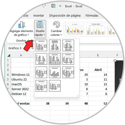
step 7
From "Quick Layout" it is possible to modify the chart layout as needed:
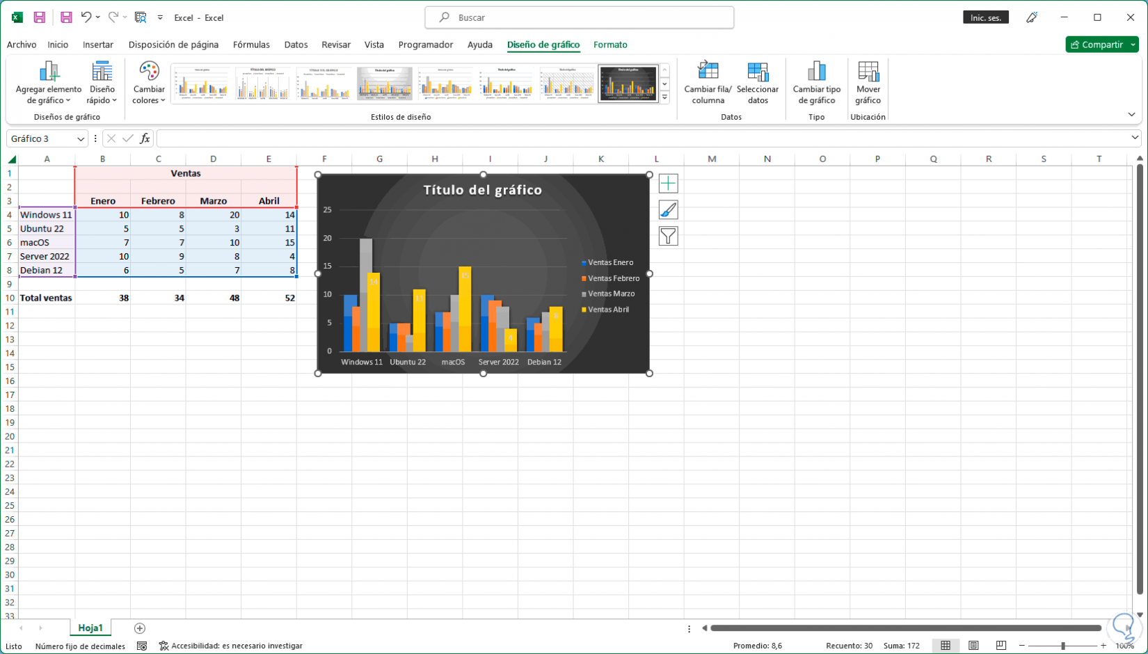
step 8
We will see the design applied based on the options that Excel offers us:
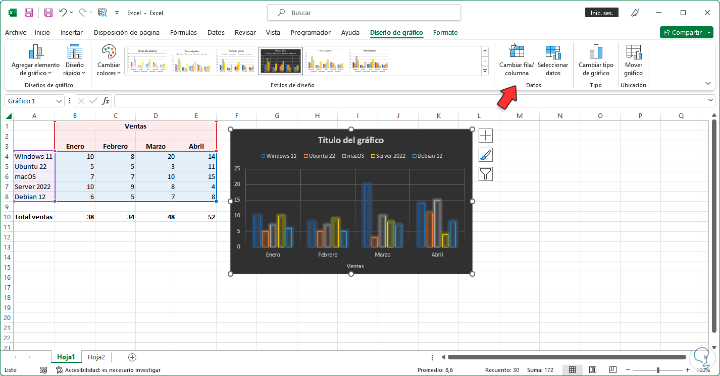
step 9
We select the graph, in the "Graph design" menu in "Data" we click on "Change row/column" to change the order of the graph:
step 10
Based on the design applied to the graph, it is possible to change the title of the graph by clicking on it and adding the desired text for a better order of the data to work with:
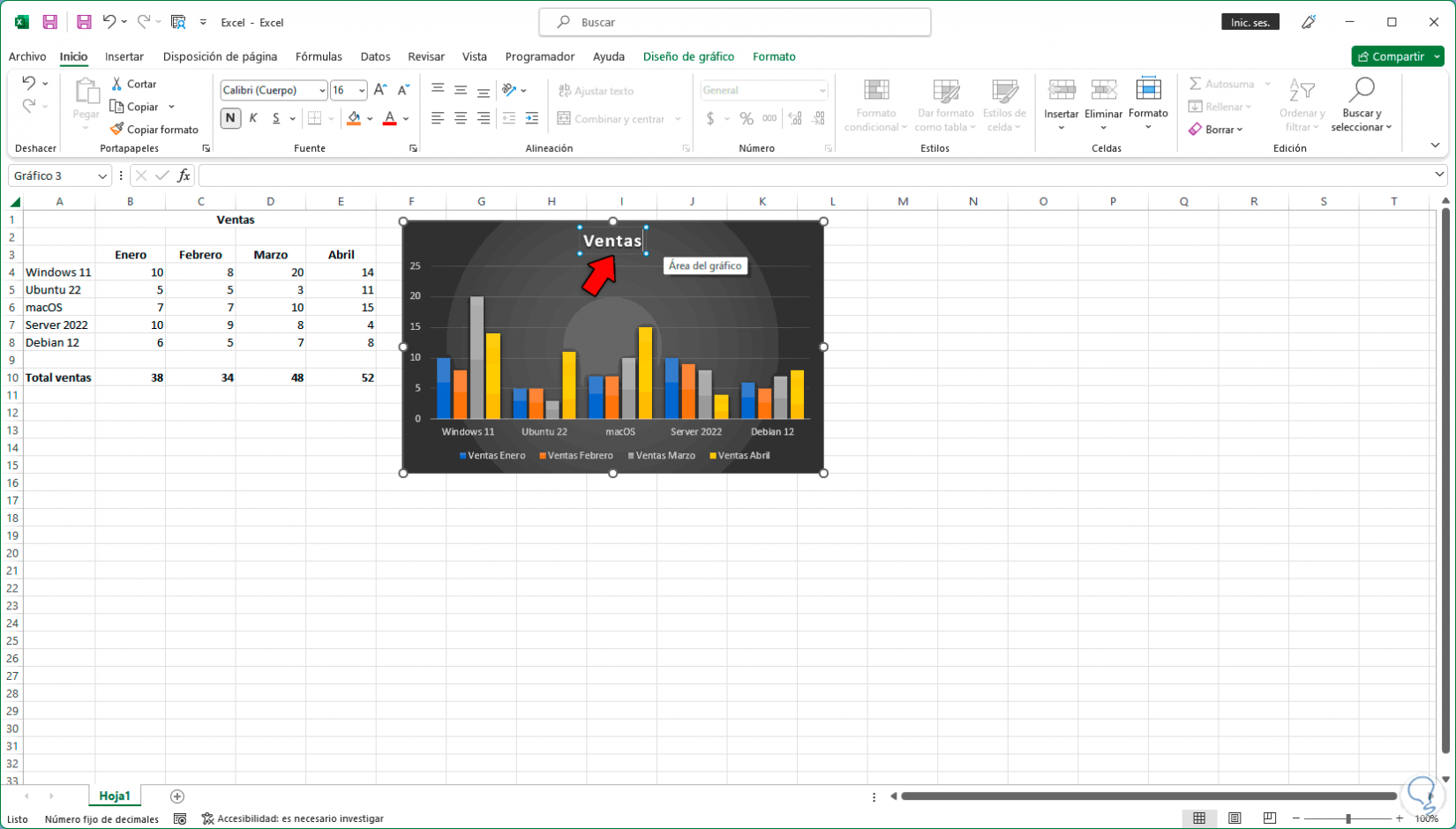
step 11
We click outside the graphic to see the name of the applied graphic:
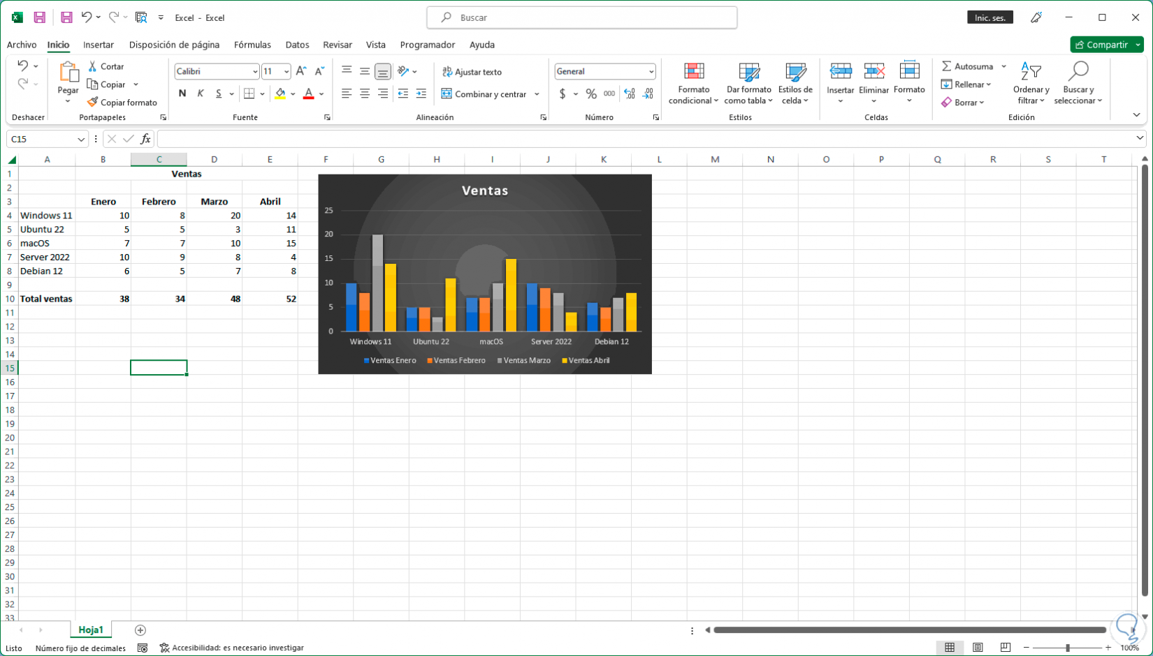
step 12
We double click on the graph to open a side menu with various options:
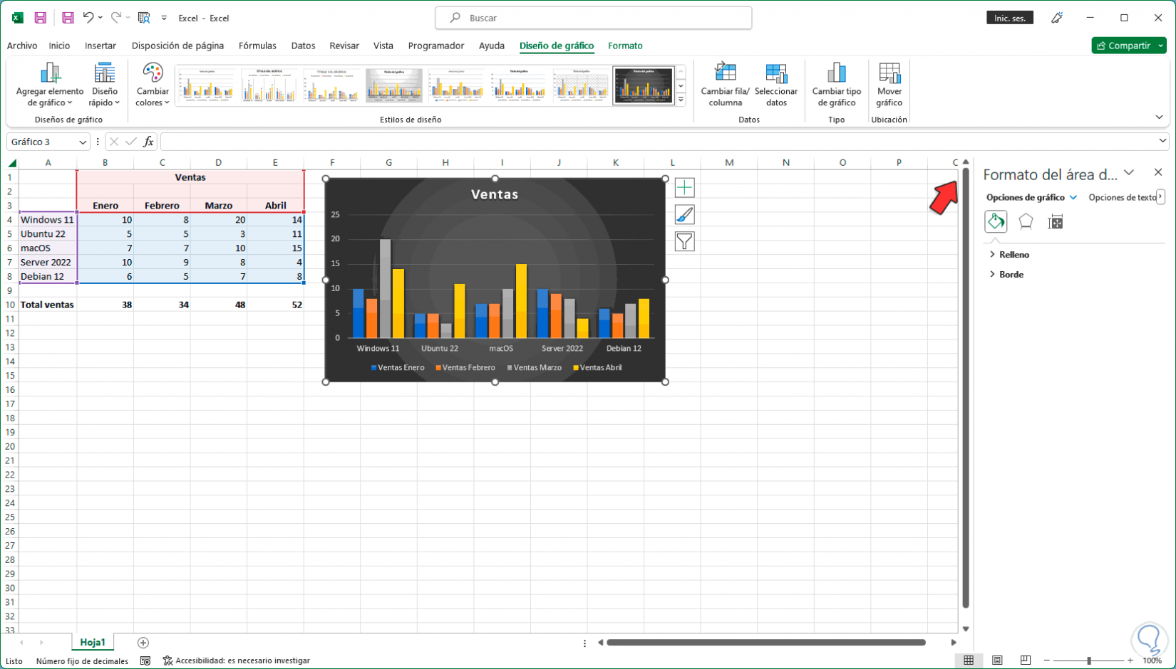
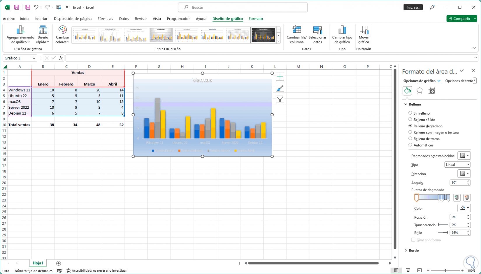
step 13
On the side, in the "Fill" section, it is possible to select one of the available options for the background of the graph, as well as solid colors and textures or gradients:
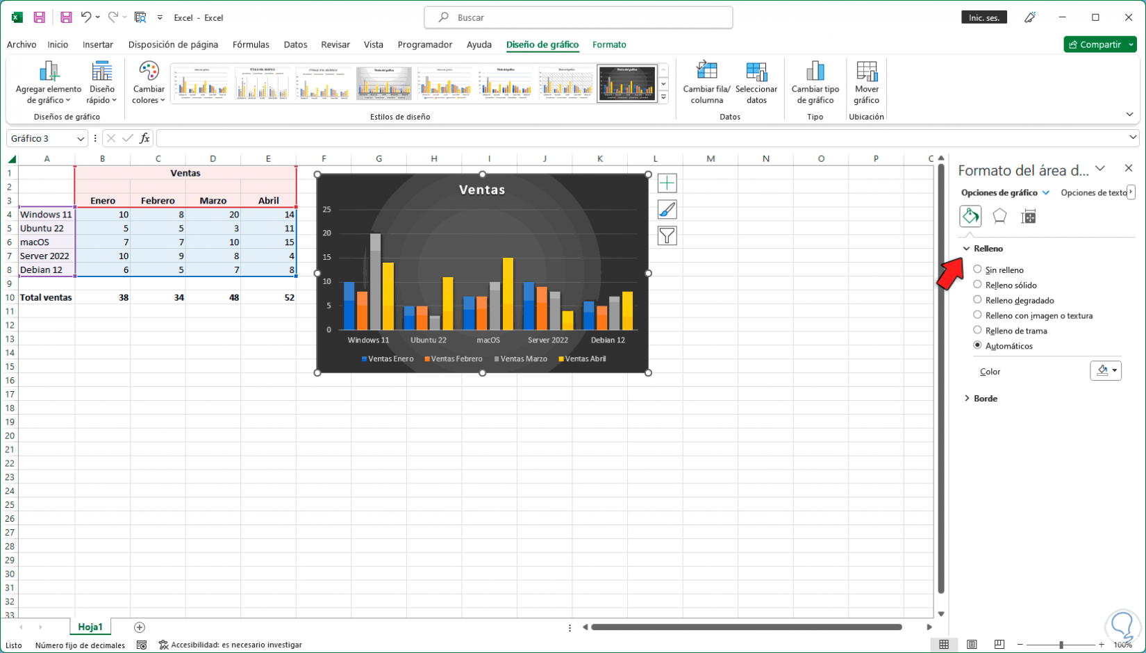
step 14
We activate the desired box to see the automatic change in the graph:
step 15
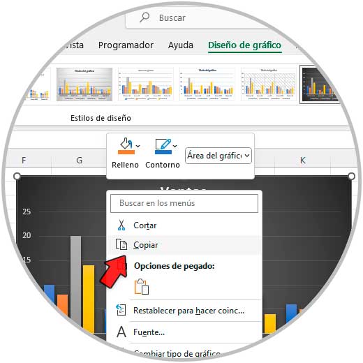
It is possible to copy our graph to other applications, in this case we right click on the graph and select the "Copy" option:
step 16
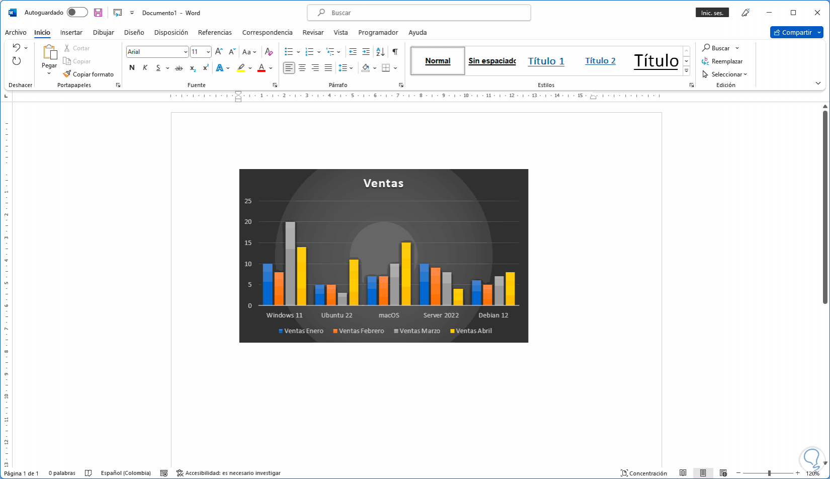
We paste the graphic in any desired editor, in this case Word:
In this way it is possible to create graphs in Excel from the available data and thus customize the result of these.