Microsoft Excel in its 2016 or 2019 editions becomes one of the most complete, dynamic and versatile solutions for everything related to the management of large amounts of data which would be complex to work under other circumstances. The data can be text, dates or numerical and when we implement Microsoft Excel for this data control we will have a large set of tools to represent this data in a complete, professional and true way..
One of the most common ways to present a report of the data provided is by using Excel charts, we have more than 10 alternatives such as:
Excel charts
- Waterfall graphics and many more
One of the most versatile graphics integrated in Microsoft Excel 2016 or 2019, is the radial chart which can also be known as Spider chart, Network chart, Polar chart or Star chart and which has three categories that are:
Excel graphics
- Radial chart with markers
By using a radial graph it will be possible to visualize the selected data in a two-dimensional way and in the process show the differences between the existing subgroups in the selected range. Basically when we create a radar chart, it will be possible to make a comparison between the values of three or more selected variables taking as a relation a central point in the active Excel sheet.
One of the main functions of a radar chart is to determine which variables have highs or lows within the selected data set and thus define precisely the results that you want to show to users. In a radar chart, each variable has an axis located in the center of the graph, so all axes will be located radially, using equal distances from each other, this allows the scaling to be identical between all the axes available in the graphic..
The grid lines, which are connected from axis to axis, are useful as a guide and each variable value will be plotted along its own individual axis and to all the variables that are connected and this results in them being form a polygon figure.
Note
This tutorial will be done in Excel 2019 but the same process applies to Excel 2016.
1. How to create a radial chart in Microsoft Excel 2019, 2016
Step 1
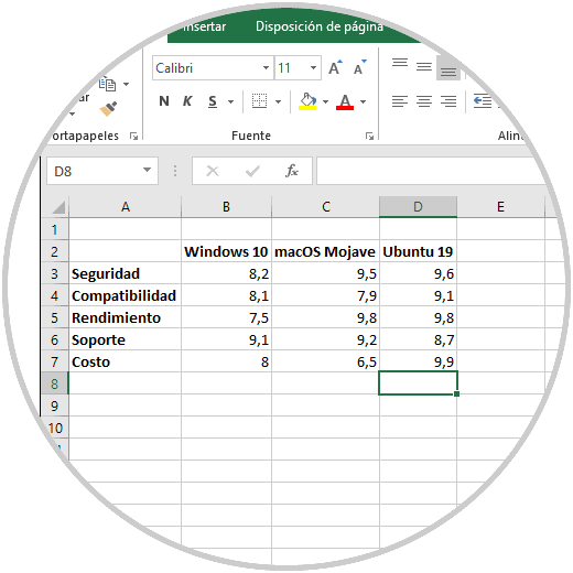
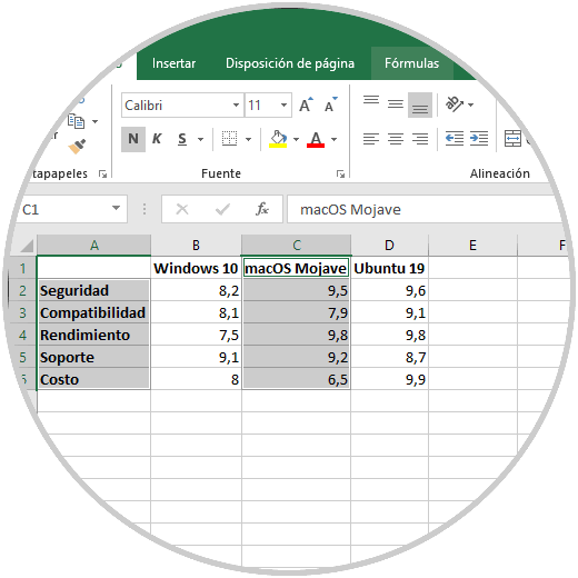
To start the process of creating our radial chart in Excel 2019 we have the following data where a series of characteristics of some of the best known operating systems will be evaluated:
Step 2
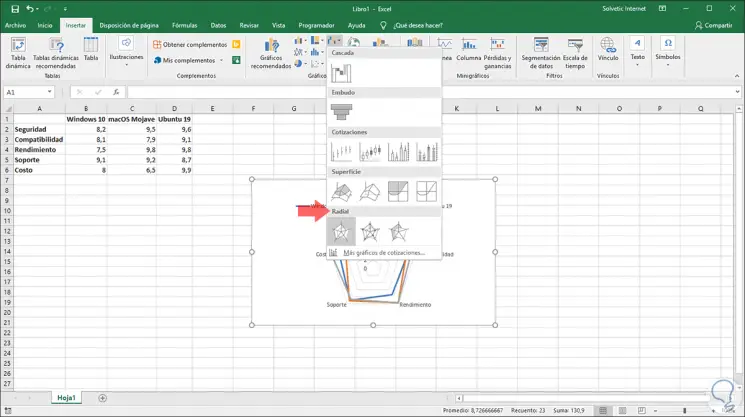
To create our radial graph, we will select the cells where the data is registered and we go to the Insert menu and in the "Graphics" group we click on the "Cascade Graphics" icon and in the displayed list we locate the various options of "radial graph " on the bottom:
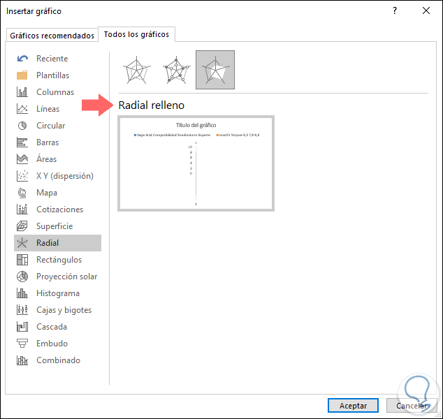
Step 3
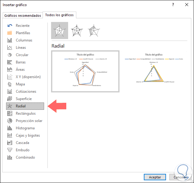
We can see that automatically the selected graphic is integrated into the active sheet where the data is registered. It is also possible to access these options by clicking on the "Recommended graphics" option and on the "All graphics" tab go to the "Radar" section where we will see a preview of each result:
Step 4
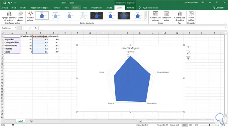
Once we select the desired graphic, it will be inserted in the sheet with the selected data represented there:
Step 5
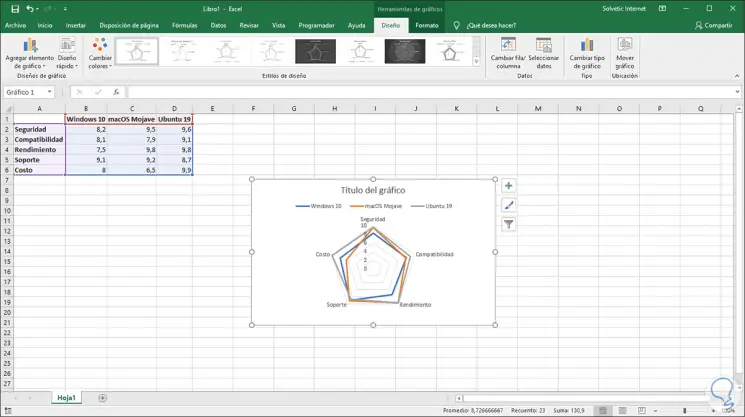
We can see that a new menu called Graphics Tools with two tabs will be displayed at the top:
Design
There it will be possible to make changes in the radial graph such as:
- Adding new elements to the graphic.
- Adjust an automatic design.
- Change the colors of the graph.
- Apply a design style different from the default
- Choose the source data if necessary
- Move the chart to another sheet or Excel workbook 2019
Format
From this tab it will be possible:
- Apply new text formats to the graphic.
- Integrate a new style of form.
- Edit the outline, fill or shape effects.
Step 6
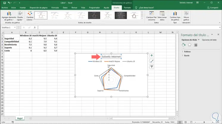
The first step to take will be to add a name to the chart. For this we click on the graph and then on the title for your selection, once this is done, enter the desired name in the formula bar.
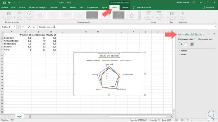
Step 7
Press Enter and the name will be modified automatically. We will see that some options are displayed both in the sidebar of the sheet, as well as in the title, from here it will be possible to edit the graphic style, add filters, etc.
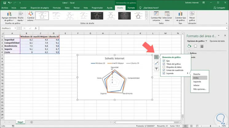
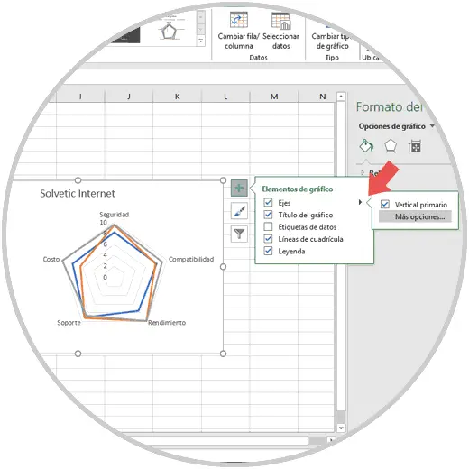
Step 8
Another action that we can carry out in the radial graph is to change the position of the legends if we wish that they are visible in another position within the graph. For this we click on the + icon and then we go to the "Legends" line and we can move it in one of the following positions:
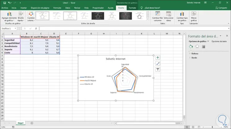
Step 9
If we select the "More options" line it will be possible to move the legend manually to the desired location. In this case we have selected the Left option:
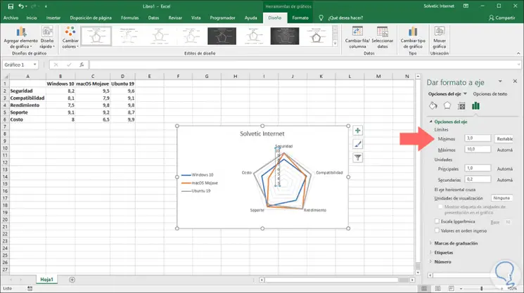
Step 10
Following the radial graph editing options, it is possible that for some reason of presentation we want to move the axes of the original location, this can help us generate a better visualization of the recorded data. To perform this action, we click on the + sign again and see it select the More options line in the Axes section:
Step 11
The options will be displayed in the sidebar and there we click on the columns icon and in the "Axis options" section in the "Minimum" field, enter the value 3.0. At the bottom we can set a maximum value as necessary.
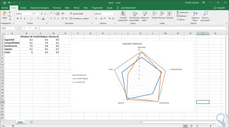
Step 12
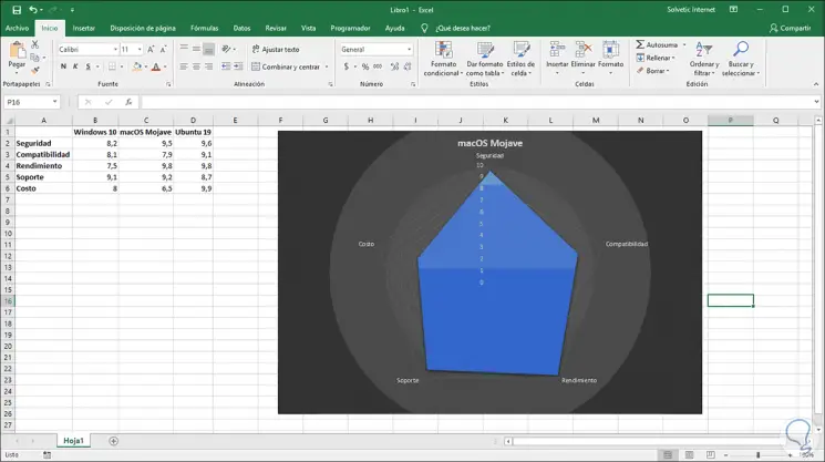
Once we make the changes, they will be applied automatically and to see the graph more completely we can change its size using its corners.
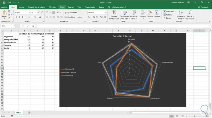
Step 13
As we have mentioned, it will be possible to make use of the formatting options to add a much more professional visual touch to the radial graphic:
2. How to create a radial fill chart Excel 2019, 2016
This is another of the options offered by the radial graph, this is useful to represent only part of the data to be used and not all in general.
Step 1
For this case, we must select the data to be represented in the graph. To select cells in different locations we must use the Ctrl key and make the selection:
Step 2
Now we will insert the radial fill graph using one of the following options:
- From the Insert menu, Graphics group, by clicking on the Waterfall Graphics icon and at the bottom select Radial Fill.
- By clicking on Recommended graphics and on the All graphics tab go to the Radial section and there choose Radial fill.
Step 3
In this type of filled graph, the data will not start from scratch, here they will start using the lowest number available in the selected cell range:
Step 4
In this case the title will be integrated by default and we have the same editing options available in the radial graph:
Step 5
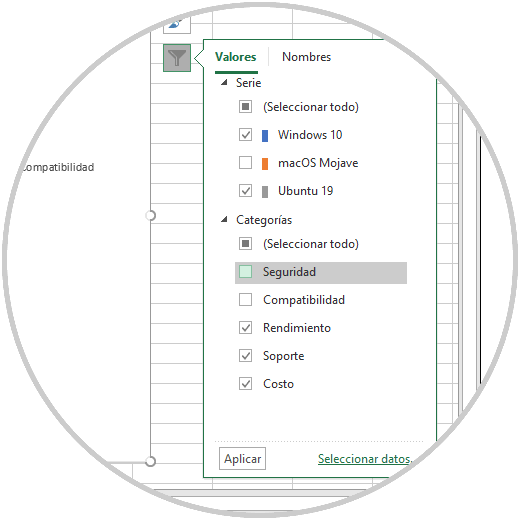
Another of the practical options when using the radial graph, independent of its category, is the possibility of applying filters to it, this allows to display results only by certain criteria, for this we click on the filter icon located on the right side of the graph and the various data options to be filtered will be displayed:
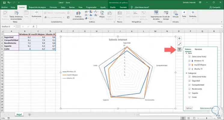
Step 6
There we can uncheck the boxes of the elements that we do not want are visible in the radial graph:
Step 7
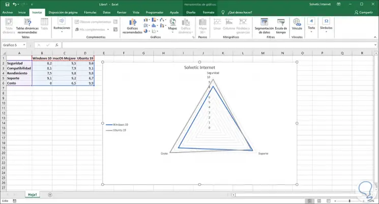
When defining the filter criteria click on Apply and the radial graph will be based on the selected filter:
Thanks to the radial graphs we have a new function to represent the data in Excel 2016 or 2019 in a much more versatile and complete way..