Logos are, without a doubt, the visible face of brands , their most identifying element. They serve to detect them at a glance and many of them are already part of the collective imagination. What is the origin and history of the best known logos?
Index
Coca-Cola
Adidas
Nike
Lenovo
Coke
After 'OK', 'Coca-Cola' is the second most recognized and pronounced word on the planet. And we'd bet your logo would too. The symbol that we all know today was originally black and was created by Frank M. Robinson, accountant of the drink's creator, pharmacist John S. Pemberton..
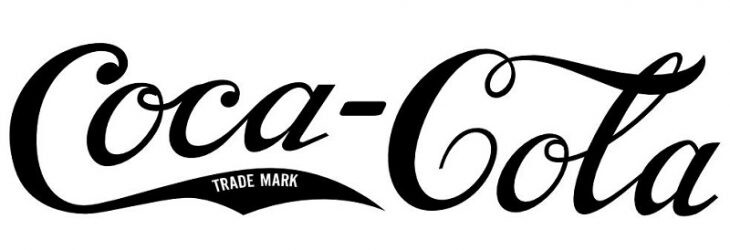
During the first decades of the 20th century, red began to be used, and it would be in 1941 when the color definitively changed and the one we all know was consolidated, much more homogeneous and pleasing to the eye. 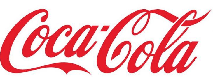
Adidas
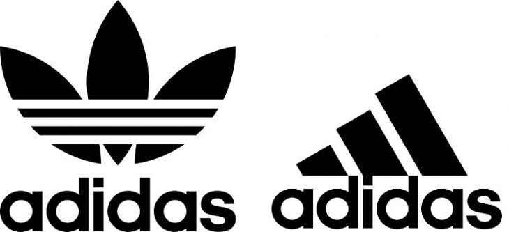
Many do not know that the Adidas brand, in the beginning, was split into two other brands. One kept the original name and the other gave rise to another famous sports textile company: Puma. Originally, the Adidas logo consisted of a laurel wreath and three stripes. This alludes to what was used in ancient Greece and Rome to decorate the best athletes. Subsequently, the logo was limited to the three stripes, although the crown was later brought back in the 'Originals' model line. The vintage , you know, is in fashion.
Nike
The history of one of the most popular logos, that of Nike, is quite symbolic: it was devised by graphic design student Carolyn Davidson. Its bases are inspired by those of its main competitor, Adidas: simple, minimalist and based on stripes or lines. According to the Brandemia page, Davidson, who was based on the wing of the Greek goddess Nike to make the famous Swoosh (as this logo is known), received 35 dollars for her work. However, in 1983, the designer received a gold ring and an envelope with company shares from the brand..
lenovo
And the origin of Lenovo? What does this name and its logo mean? Originally, this company, founded in Beijing, was called Legend Group LTD and New Technology Developer Incorporated. A too long name that ended up taking 'Legend' and 'New' as parts of a whole: 'Le' (Legend) and 'Novo' (new). Every time we say 'Lenovo' we are actually referring to ' new legend '. The company logo bets on its own name, in an example of simplicity and clarity. The main symbol appears in white on a bright red background, with the first letter capitalized. Previously, the logo was superimposed in lowercase letters on a somewhat duller blue background.
