Among all the options that Excel offers us to manage the data, some are more relevant than others and one that is little known but functional for certain tasks is the option to create a histogram in Excel..
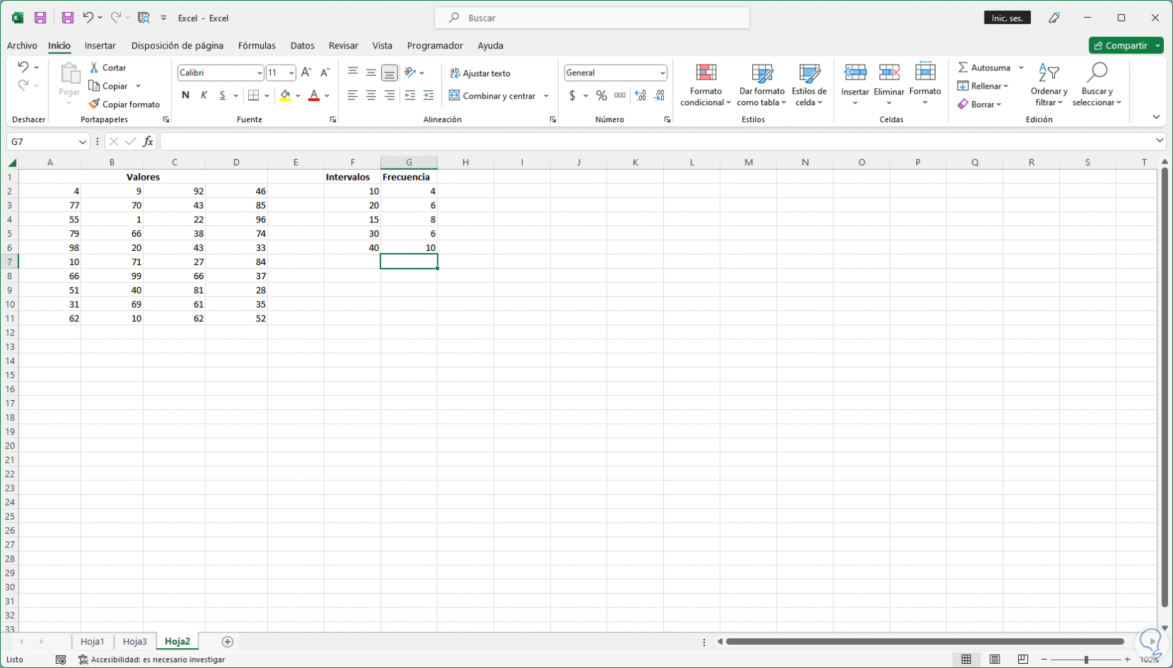
A histogram allows you to see the shape of the data based on some established criteria, in order to create a histogram in Excel we require two types of data that are the data to be analyzed and the location numbers which represent the intervals to measure the frequency, these Data must be recorded in two Excel columns and they are:
excel columns
- Input data which are the data that we are going to analyze using the Excel histogram tool
- Location numbers which are the numbers that represent the necessary intervals with which histogram will measure the input data for the respective analysis
Note that Excel will create a set of locations evenly distributed between the minimum and maximum values from the input data.
Let's see how to create a histogram in Excel completely and thus be able to customize it with our data..
To stay up to date, remember to subscribe to our YouTube channel!
SUBSCRIBE ON YOUTUBE
How to create a Histogram in Excel
Step 1
We open Excel to see the data to represent:
Step 2
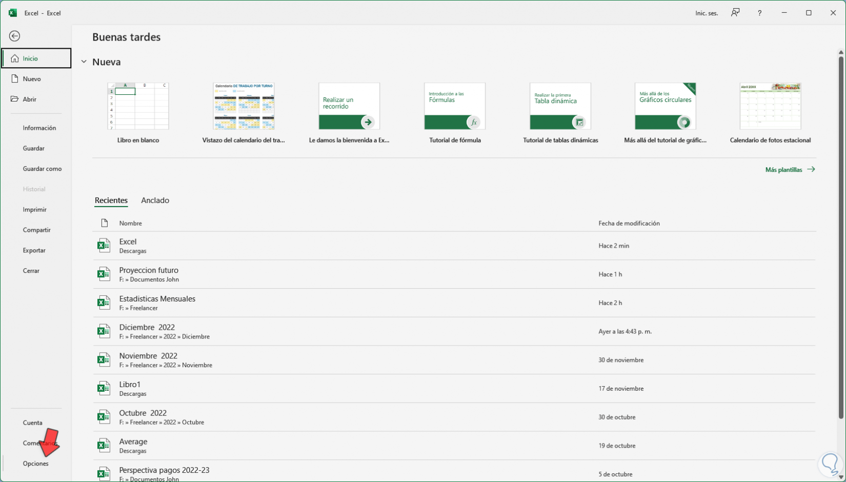
Now it is necessary to enable the Histogram tool, for this we go to "File - Options":
Step 3
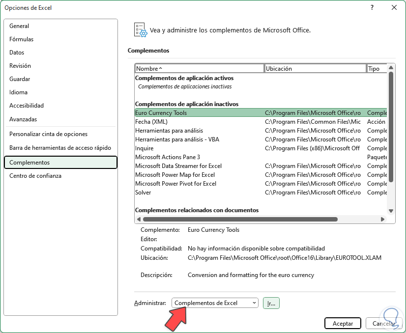
In the pop-up window in "Add-ins" we select in "Manage" the option "Excel Add-ins":
Step 4
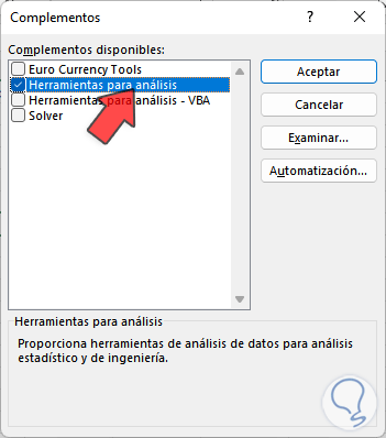
We click on "Go" and in the next open window we activate the "Tools for analysis" box:
step 5
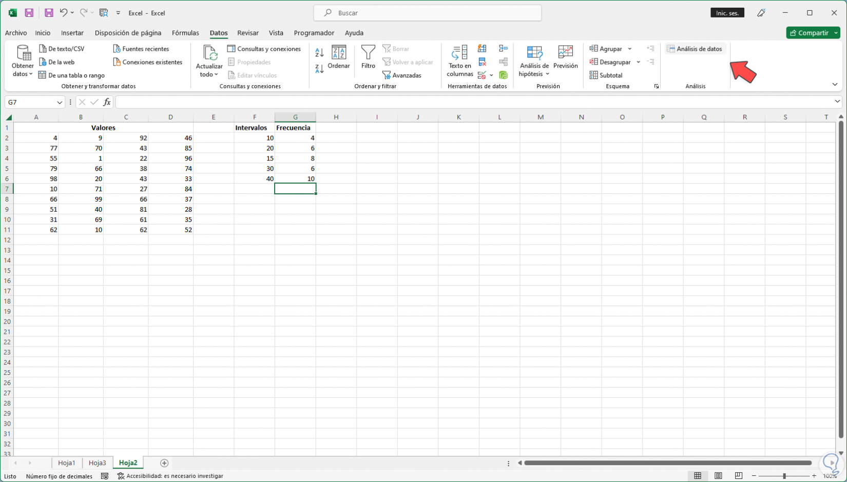
Apply the changes. Go to "Data - Data Analysis" (the Data Analysis button will have been created):
step 6
We click there and in the pop-up window we select the "Histogram" option:
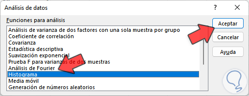
step 7
We click "OK" to see the following:
step 8
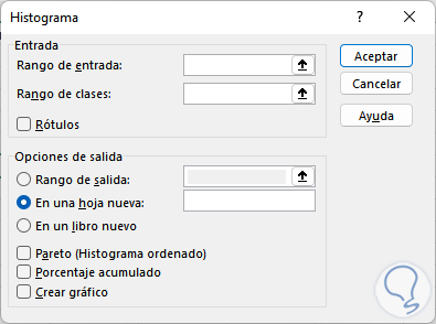
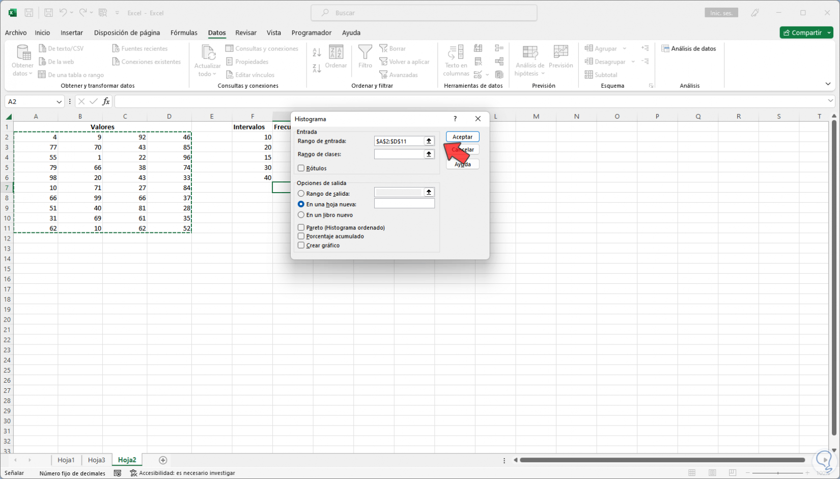
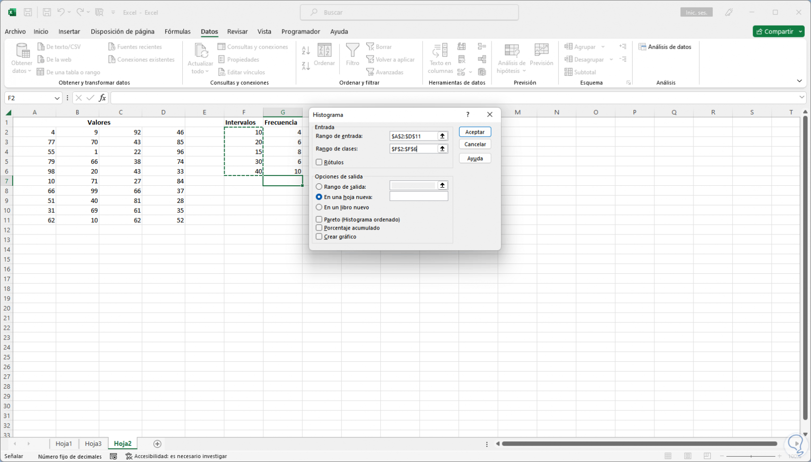
In "Range of inputs" we select the values to represent:
step 9
In "Range of classes" we must select the Interval cells to use:
step 10
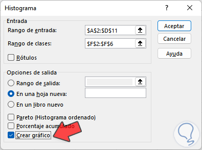
We can see the selected ranges and activate the "Create chart" box:
step 11
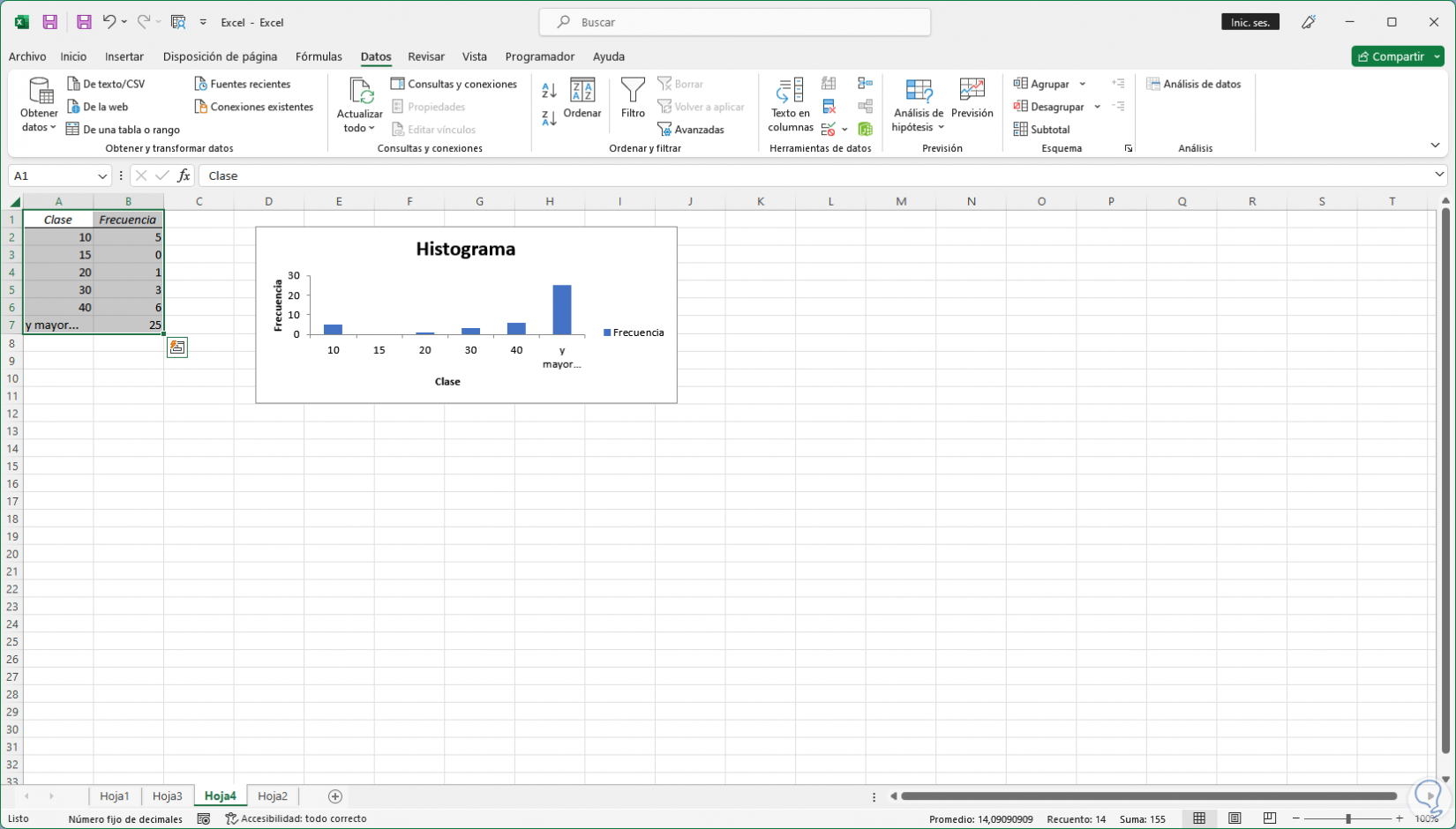
By default the graph will be created in a new sheet, we click "OK" and in a new sheet we will see the histogram created based on the data collected:
step 12
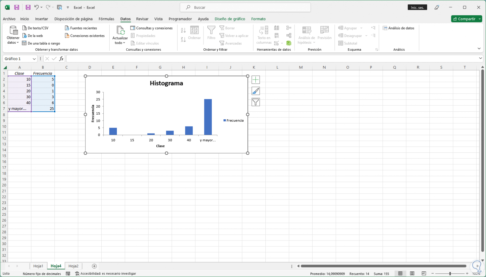
We can enlarge the graph to have a better perspective of the result.
In the result we can see the word "and greater" which indicates that the histogram can give results greater than those projected.
It's that simple Excel allows us to create a Histogram to project data stored in the sheet..