Microsoft Excel is full of functions, formulas and features that help users to manage data (which can be really large) in a much simpler way, but at the same time complete and true, within everything we can do in Microsoft Excel 2016 or 2019 , we found a special function that is the trend line ..
As the name implies, it will be of great help to graphically show how we are carrying our data and based on it determine whether we are going in profits or losses (if we talk about business), increase or not of users (if we are human resources environments), etc., so we can take direct actions on the data to improve them if this is the case.
With the trend line we will have a useful data analysis tool that offers us at a glance how concrete data is evolving. Thanks to this type of graph we can predict how the data will be in subsequent games. This is very useful in terms of sales or growth in general because if we see a positive trend we can predict good data. To compare years is also really useful knowing that months have been stronger and where the trend line grows the most..
Through this tutorial, TechnoWikis will explain how to create a trend line in Excel 2016 or 2019.
To keep up, remember to subscribe to our YouTube channel! SUBSCRIBE
1. How to create a trend line in Excel 2016 or Excel 2019
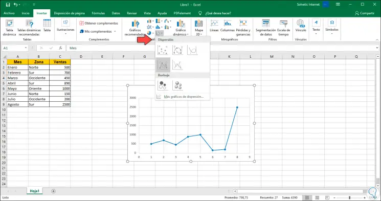
Step 1
First, we will select the data to be plotted and go to the Insert menu and in the Graphics group we select the type of graph desired for this purpose, in this case we select a scatter plot:
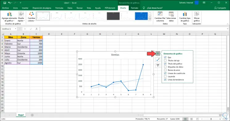
Step 2
Once the graph is integrated into the spreadsheet, click on the + sign located in the upper right corner and in the options displayed, activate the “Trend line†box. We can see how the respective line is added to the graph.
2. Trend line types in Excel 2016 or Excel 2019
Step 1
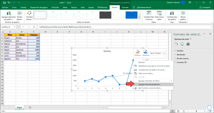
We can click on “Trend Line†to list the different line options to use. To display all the options we can select any of the points on the graph, right click and select “Add trend line†in order to display the Excel side menu associated with the trend line:
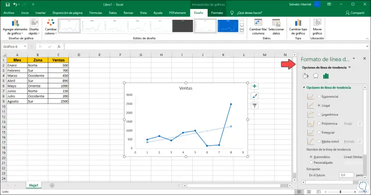
Step 2
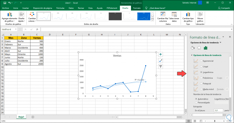
We can find these differences:
Linear
It is the default one in Excel and is formed by a line that increases or decreases based on the data provided in the spreadsheet.
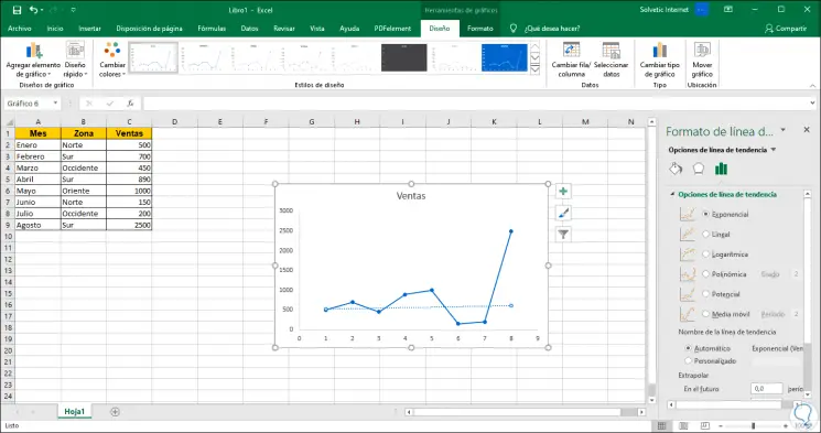
Exponential
It is ideal when the data values ​​increase based on the values ​​of x, there the exponential trend line offers a much more orderly view of the data.
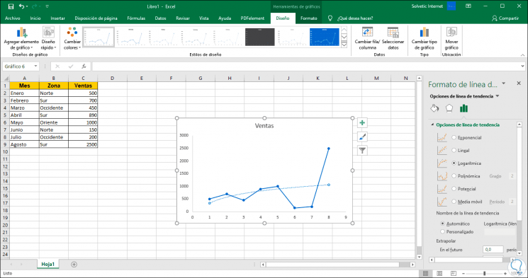
LogarÃrtima
It is a special logarithmic trend line to view the data as the rate of change decreases if the values ​​of x increase.
Polynomial
It is ideal where the data has an upward and downward trend based on the wave patterns and its design allows you to see the amount of curves in the graph either up or down. Note that the “Degree†field is available in which we can define its curve.

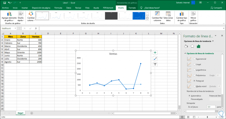
Potential
Applies where data tends to increase frequently.
SMA
It is an ideal line in cases where the data is very variable, since it takes an average since this line will take the average of every two points in the given graph.

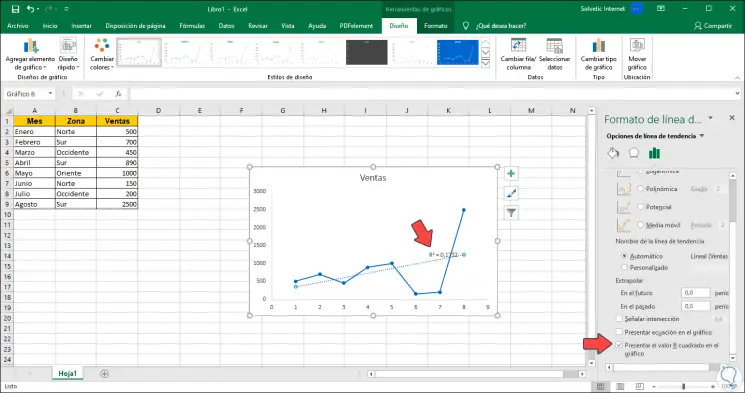
3. Activate and select the R value in the chart in Excel 2016 or Excel 2019
In the lower part of the options of the trend lines we find a box called “Present the value R squared in the graph†which will display said value R. This is a measure that indicates the distance of each point in the trend graph, so the closer the square R value is to each other, it means that the lines will fit better to the data trend.
When activating this box we see the line with the R square value in the selected graph:
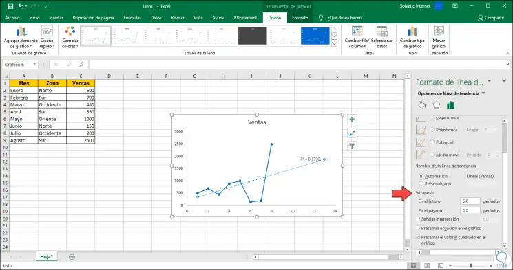
4. Use the Extrapolar function in Excel 2016 or Excel 2019
Extrapolar is synonymous with forecast in the data, there we have the options "In the future" and "In the past" and are measured in periods, so we can define how many periods in the future to apply and the trend line will do the rest, We have added 5 in the “In the future†field:
5. Add different trend lines in a chart in Excel 2016 or Excel 2019
Step 1
For design or management reasons, it is possible to add multiple trend lines with a range of data, for this we must select one of the points on the graph, right click and select “Add trend lineâ€:
Step 2
After this, just select the type of line on the right side:
6. Trend line customization options in Excel 2016 or Excel 2019
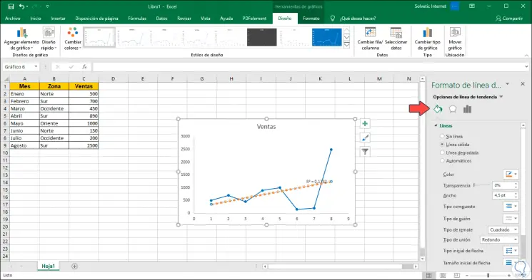
Edit line appearance
From the option “Fill and line†we have alternatives to edit the line with variables such as line type, color or line thickness, as well as apply effects:
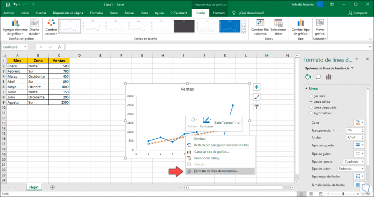
Edit line parameters
Finally, if we want to edit the parameters of the trend line, we can right click on it and select the “Trend line format†line. This will redirect us back to the right side panel to define line types, forecast and more.
7. Create a trend line in Excel 2016 or Excel 2019 using the keyboard
We show you another very simple way to draw a chart and the trend line in Excel 2016.
Step 1
Create the Excel table that you will use as a base to make the graph, and be able to see the trend line later.
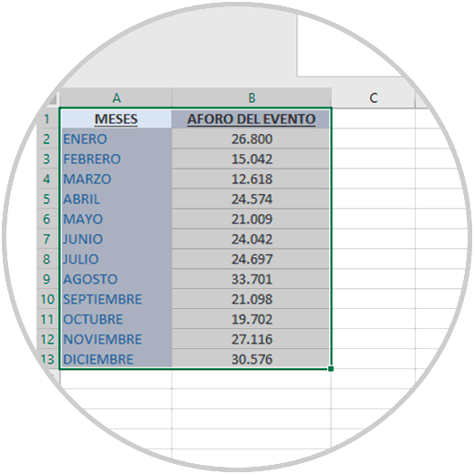
Once the table is made, select the data in the Excel sheet, the data you want to represent in the chart. We advise you to select the headers when selecting the data. In the image below you can see that the entire table has been selected with the headings and the values ​​that in this case are associated with each month
Step 2
Press the F11 key. With this you generate the graph automatically. You will see that the graphic has been created on a new sheet, within the document you are working on. From here you can change the graphic design, colors, type of graphic or add elements.
F11
Step 3
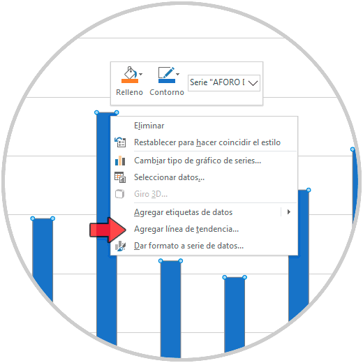
To draw the trend line, on the new graphic that you have created by pressing the key on your F11 keyboard, place the mouse pointer on some value within the graph (in the line, bars or area of ​​the graph, it depends on the type of graph ).
Press the right button of your mouse, you will see that in the menu that is displayed, one of the options shown is “Add trend lineâ€..
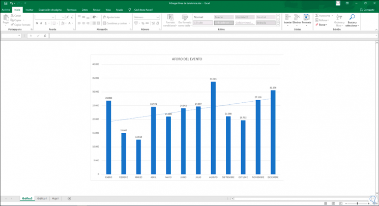
Step 4
Click to show on the graph the trend line that you will see by default in the same color as the bars or line of the graph, represented with a thin dashed line. Then we can customize the line or add more as we have seen in the previous chapters of this tutorial.
With the trend lines in Microsoft Excel 2016 or 2019 it will be much more viable and practical to manage the future of the data that is recorded in the spreadsheets and with this we can take corrective measures or improvements so that the trend line adapts every day to user needs.