Fabbing is when your interlocutor spends too much time on the phone in front of you. According to recent research, the more people engage in fabbing, the more conflict situations they have when communicating with other people..
To reduce the time spent with the gadget, you can start using minimalistic launchers from third-party developers. They will change the Android interface to a more rigorous one, so that you are less tempted to launch YouTube, Instagram and other "time eaters".
Indistractable Launcher
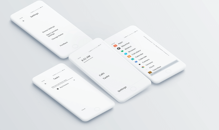
The Indistractable Launcher developers were clearly inspired by the interface of the LightPhone smartphone. The minimalistic design is the first thing that you will notice when working with the application. High-contrast graphical user interface with white text on a black background. The main screen shows the time, date and battery level..
Basic functions can be accessed directly from the home screen, including making calls with access to the on-screen dial pad, contacts, and incoming and outgoing call history.
Tasks is a built-in task manager. It's simple enough and works great as a day-to-day planner. The to-do list for the day can be deleted completely or edited point by point. If there are too many tasks and they do not fit on one screen, the scrolling function is enabled..
The launcher has two main pages: the home page and the application page, which is invoked by swiping from right to left. When you launch it, a list of all installed applications appears with a short description. By tapping any of them, you can delete unnecessary ones or add them to the "Favorites" and display them as text on the home screen.
A small icon on the main screen brings up a window in which you can change the device settings, change the launcher or change the theme. True, at the moment there are only two topics: light text on a dark background, and vice versa.
Launcher settings are grouped in a separate section. Here you can also specify whether applications will be displayed as icons or as text; hide the status bar or battery level indicator; change the time and date format. There is no option to hide an application in their list.
LessPhone
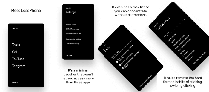
The only launcher on the list, recommended by Unbox Therapy , lives up to the no- nonsense slogan. LessPhone is a lot like the Indistractable Launcher. There are differences, but they are minor. For example, the time is shown at the top of the screen, and the battery level is shown in the upper right corner. Like Indistractable, LessPhone has a task manager. To call someone, you need to click the Dialer button in the lower left corner.
Although the approach to the interface is similar to the previous launcher, the developers have gone a little further. For example, important and frequently used applications are grouped into a separate Custom App section displayed on the home screen, where the user can add up to three programs. It is possible to increase their number, but this feature is paid.
The settings button is in the lower right corner. From here you can access the system settings and the launcher itself. In this section, you can change the default applications: browser, launcher, phone, message manager.
Linux CLI
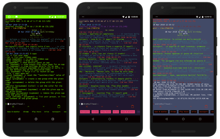
If you are a programmer, Linux CLI Launcher can be your favorite launcher. The interface looks like a terminal in Ubuntu. To launch the desired application, you need to enter its name and press "Enter". Several additional functions are also offered, for example, file search, calculator, or the ability to call the desired contact from the phone book by entering the command "Call + subscriber's name".
And you can also give commands to change the volume, turn on / off Wi-Fi, uninstall applications and a dozen other commands. To see all the possibilities - enter the help command.
AIO Launcher
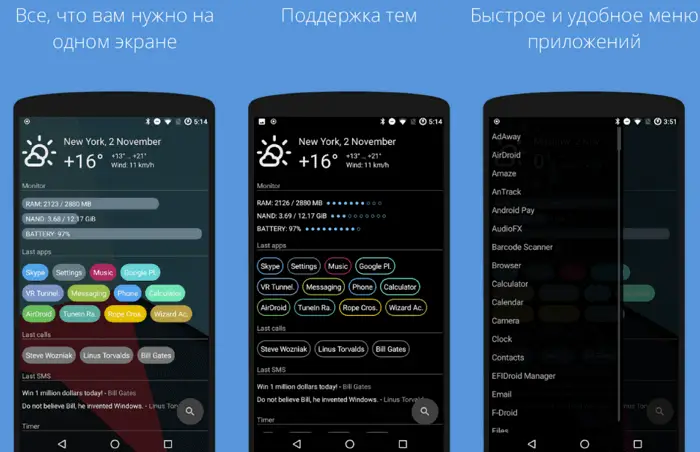
AIO Launcher is completely opposite to the previous launcher. Its sole purpose is to show all the important things on one screen. Here you will find frequently used applications, notifications, time, weather, date, timers, letters, calendar events, Twitter, quick actions, etc. To open the list of installed applications, you need to swipe to the left or you can click on the search icon and enter the desired name ...
Boring Phone

The interface of the third application from our list resembles the UI of the first two, but more options are available to the user. One of the few common features is a task manager with a daily routine planner.
Boring Phone can be attributed to minimalistic launchers only with some stretch, but this application is still less demanding on resources than the "native" software shells of smartphones.
Apps appear at the bottom of the home screen. Here you can add up to eight icons of the applications that you launch most often. The developers did not provide access to all applications. So if you are not ready to immediately identify the 4-8 programs you want, be prepared to repeatedly edit the list. You can hide and resize icons.
On Android, notification settings are only available through general phone settings. In Boring Phone, they are invoked by the bell icon at the top of the screen. Here is the system settings and menus with a choice of up to eight applications displayed on the main screen.
The paid version has the ability to change the theme (including the "neon" color scheme), background color, date and time format.
Android has two apps responsible for resource usage statistics, but Boring Phone has its own built-in counterpart. Information is available in the form of a chart or a list. Using these statistics, it is easier to select applications that are important to you and understand which programs are time-consuming.
Ap15 Launcher
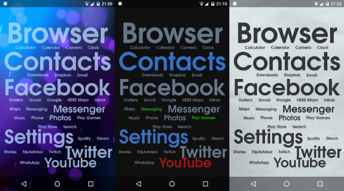
Pay attention to Ap15 Launcher - all applications are displayed on the home screen as text. You can access everyone, not 4-8, as, for example, in Boring Phone. Frequently used applications are shown in larger print at the top of the screen and settings can be adjusted and saved.
There is not much to customize as there are no graphical interface elements. But the parameters of the text are easily changed. Pressing and holding the name of the application opens a menu through which you can access the settings, change the font color, rename or delete. It is possible to reset to default settings.
Changes the color, size, style of the text; font color of notifications. The background of the main window is configured: you can change the color or upload a picture that will be set as a background image.
Siempo
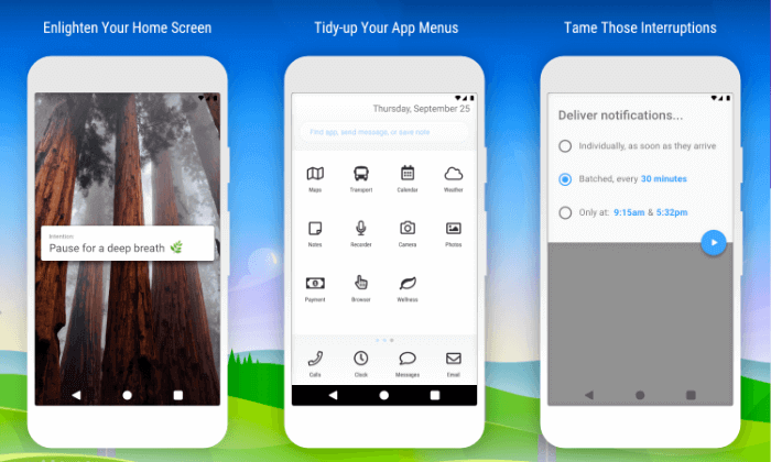
Anything successful starts with good intentions - this is true of Siempo. This launcher has four scrollable screens. The first is called Intentions. Here you can write the phrase you want to see on the home screen.
The second screen of the Tool Kit is the default applications. For example, programs for fitness or photography and video filming. The third screen is frequently used applications. Here is the software you usually work with (WhatsApp, Reddit, others). The fourth window displays applications that are not in use.