Once our data model has been built, and the calculations and operations that we need to do in our tables have been carried out, it is time to move forward and land in the Power BI report view, from where we can make tables, as we explained in how to make tables in Power BI, and from where we can make graphics and other ways to represent and "paint" the fields of our tables..
In the project, or work that we carry out in Power BI, we have several moments that are key to successfully completing the work started. The graphs will help us to build a report or a Dashboard, using the techniques we have been learning along the way, and overcoming the challenges we face when using Power BI as a modeling, analysis, and reporting tool.
Ensuring the veracity of the data, the consistency, not having data should be the predominant priority, as we have already commented on other occasions. Making graphics as we are going to see below is a very important task, but one that Power BI has simplified to the maximum to offer us an interface in which we can build graphics at the speed of light..
Data modeling is another of the tasks that are at the top of the priorities when we work with Power BI, as well as knowing how to complete our tables with calculations, operations that we see are necessary to be able to represent in this reporting phase. , where we are shaping the data. Nothing can go wrong here, we need to work with a data model with related tables that show us real and complete data.
Making calculated fields in Power BI and measures can be complex due to the idiosyncrasy of DAX, a language that Power BI uses to perform calculations, and in which we are not used to working. However, as we already explained in how to make formulas in Power BI, Dax will not be a problem either, and you will be able to make any formula, just as we explained to you..
Creating formulas in Power BI to make calculated fields and measures has great value in this reporting phase that we are going to delve into. As we already explained, all the calculated fields or measurements that we carry out in previous phases will become a reality in this reporting phase. Above all, when we talk about the measures, which, as we already know, are not physically added to the table as a new column. If not, it remains as a calculation made to be able to use it precisely in these phases where we are going to represent the data, where we are going to represent the results and the evolution of the main KPIS with tables, graphs and other utilities, those that determine the success or not the results. As well as all the value fields that lend themselves to being represented in a graph due to its importance.
We have to think that the work must be done, and now it is a matter of locating the graph that best represents each KPI, or value field that we want to "graph". As we will see below, we will be able to create graphics at the speed of light.
Once these challenges are overcome, we are going to go to the report view and start "playing" with the Power BI options to be able to make graphs.
Steps to power charts in Power BI
- In order to chart in Power BI, we must have the data imported into Power BI Desktop.
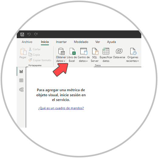
- If you have doubts, or need to see this step again, we will explain it to you in how to make a data model in Power BI.
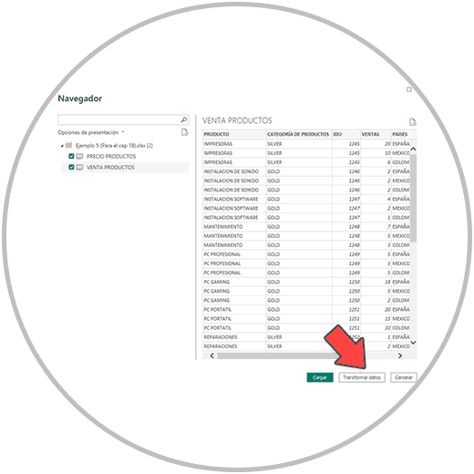
- It is recommended to go through the data transformation phase.
- Then, from the model view. We check that our tables have been linked correctly.
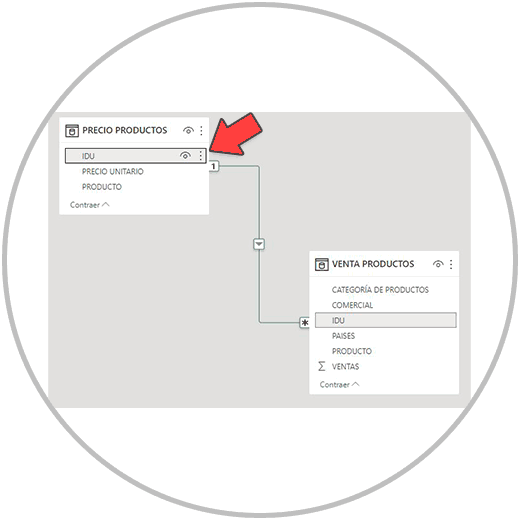
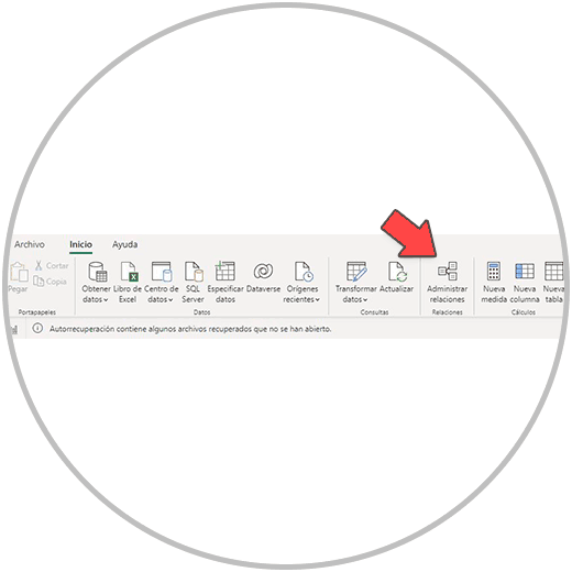
- Remember that by clicking on the line that joins the tables, the fields that Power BI has used to automatically relate the tables will be highlighted. If there is no relationship between the tables, or the fields that Power BI Desktop has used to relate the tables are wrong, we must manually establish the relationship ourselves, dragging the field that we are going to use as a connector to the other table. Or we can go to the taskbar, manually establish the relationship between two tables from "Manage relationships".
- Once the tables are related, we will check what columns or fields our tables have, and if we need to add any columns or perform any calculations. At this point in the project we should already be thinking about the values, metrics or KPIs that we want to represent in a graph. We have to think if we have all the necessary fields to be able to make a complete report.
Important
Remember that, in order to make calculations, we will use the calculated fields, which must be added by first adding a new column to one of the tables; Or we can use the measures, which, as we already explained in detail in how to make formulas in Power BI, we can easily create following the advice that we already explained.
In any case, we will be able to go back if at some point when we are preparing the report, we observe that we need to perform some calculation. But you must also keep in mind that, in order to keep order and organization in our project, it is better to close stages and when we get to the reporting part, be sure that everything done is correct, that we have all the data necessary to be able to create the graphs in Power BI.
Once we have modeled the data, connected the tables, and created the appropriate operations in each case, we are going to go to the visualizations or reports view.
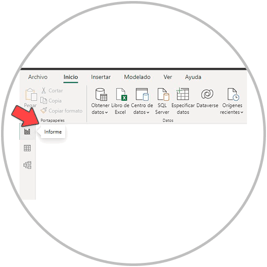
Once we open the report view, we see our empty dashboard where the tables, graphs and other plugins we use to represent the data visually will be created. As you can see in the image below, we have many graphics options:
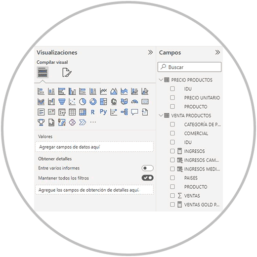
In order to create a chart in Power BI, we just have to first select the type of chart we want in "Visualizations" and then, in "Fields", select the fields we want the chart to display. We can select any column or field from the data tables, including the measurements we have made or the calculated fields.
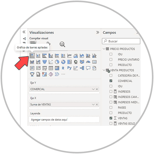
Let's see with our example how to create various interesting graphs in the report view. In our example, we have data from a company that sells computer products, we have information on the sale associated with the vendors, we have a breakdown of the type of product that has been sold, and some more attribute of the sale, such as the location of the sale, as it is a international company with presence in several countries.
1 How to make a bar chart in Power BI
A bar chart is a visualization used to represent data in rectangular bars. Normally this type of graph is used to be able to make comparisons, not to see evolutions over time.
In our example, we are going to use this graph to be able to compare the sales that the sellers have made.
We first select the horizontal bar graph, as you can see in the image below, and on the right we select the fields "COMMERCIAL" and "SALES.
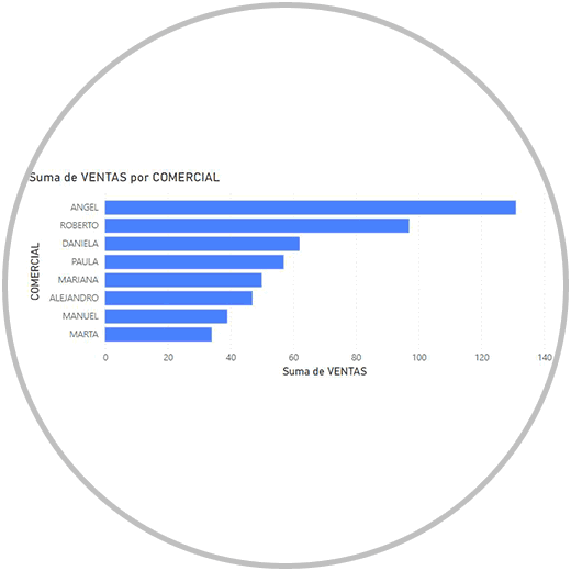
Once we select the fields, Power BI makes the graph as we see below, ordering the sales of the commercials from most to least. This way we can see the total sales grouped for each seller, and the comparison with the rest of the commercials.
How to put data label on a graph
In order to put the value or value label on the graph, we click on the graph and we will see how in the "Displays" menu, on the right of the screen, three options are activated. We will click, as we show you in the image below, on the middle option to be able to format the graphic that we have just made.
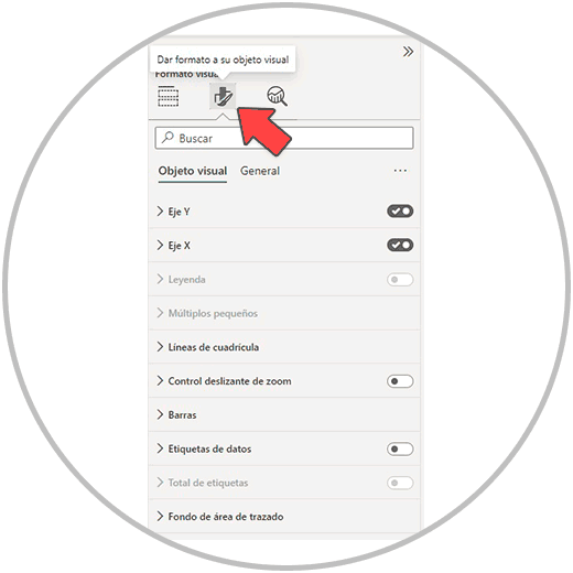
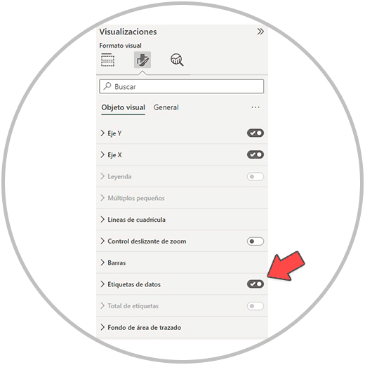
Once we click on the icon to format the graph, we look for the "Data label" option and enable it by clicking on the icon that we will see on the right.
From the option to format the visualizations, we will be able to edit the graph and change the style, the colors, hide the values of the axes. We can also add a horizontal scroll bar (called “zoom slider”) for when we have very different values within the graph and we need to move or “scroll” within the graph itself. From the format options we can also change the background of the graph, or add or remove the legend.
2 How to make a stacked column chart in Power BI
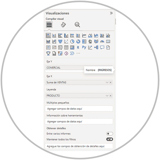
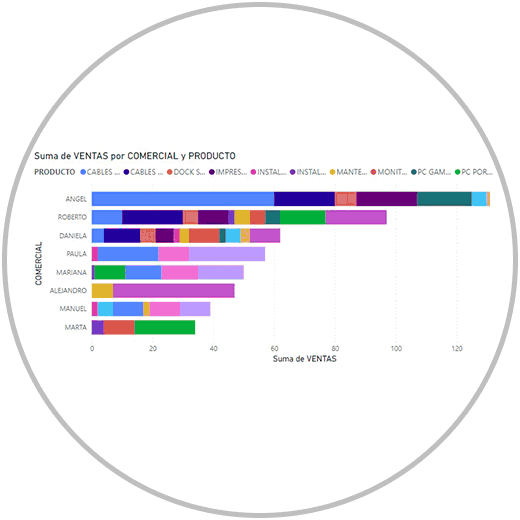
With the same type of bar chart, we can add more information. For example, in the example that we are looking at, we want to see the sales made by commercial. And, in addition, we want to add the products to the graph to be able to see, on the one hand, the total sales and, on the other hand, to be able to see which product each seller sells the most. In this case, we would select, as we have already seen, the stacked bar chart, we would select the fields on the right, which in the example would be; “SALES”, “COMMERCIAL”, AND “PRODUCT”.
Now below, in the visualization menu, we should have the "COMMERCIAL" field on the Y axis. The "SALES" field on the x axis, and the "PRODUCT" field on the legend. (As in the image below).
By configuring the graph in this way, we would see the graph that you can see below:
Bar charts are very useful for comparing data; But if it is about giving perspective in time, if we want to see evolution and trends, we will better use linear graphs, or line graphs.
3 How to make a line chart in Power BI
A line chart in Power BI is a visualization used to represent the relationship and trend of data over a period of time. This type of chart or visualization is best suited when we want to view and analyze numerical data over time, to see fluctuations and trends over a period of time. Normally the line chart in Power BI, Excel or any analysis tool we use, this chart is used when we want to see the evolution of the values of a field or column over time. This way we know if the trend is bullish or if it leads to a downward trend, or if it remains at similar values over a period of time.
In order to make a line graph over time, we follow the same process as before, selecting the “Line graph” option from the display options, which you will recognize by the icon, and then on the right we will select the fields that we want to represent .
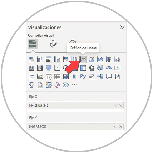
How to make a line graph on two axes
If we want to make a line graph with two axes, in order to be able to face two fields in the same graph, we only have to move one of the fields to the secondary Y axis. (In the same "Displays" menu as you can see in the image below )
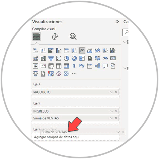
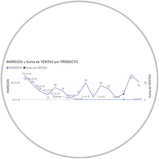
This would be the case, for example, according to our example, of facing sales and income to see how they correlate; If despite increasing or maintaining sales, income is maintained or increases, or if they follow the same curve.
Making a graph on two axes is a very useful function and one that you have surely used in Excel to be able to see two metrics of interest on the same graph. In the example we have faced sales and income, but we could compare other metrics such as expenses, subscriptions, visits, ...
In Power BI, as we have seen in the example, to make a linear graph on two axes, we will have to look in the graph options, the linear graph icon, select the fields that we want to use in the graph, and move one of the metrics to the Y secondary axis.
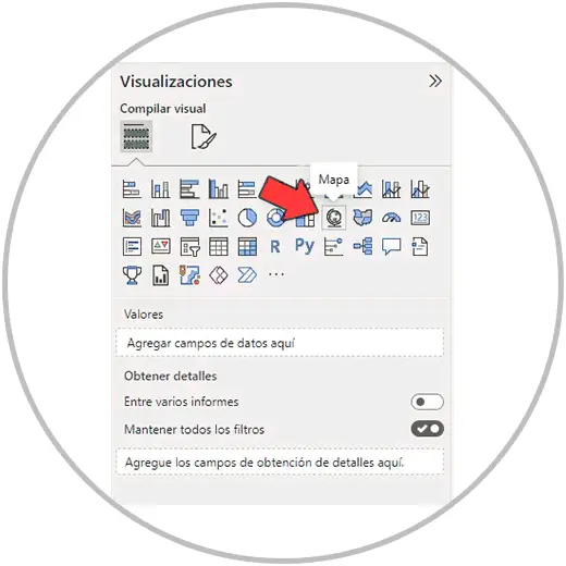
4 How to make a map chart in Power BI
Map charts are visualizations that show values represented on a geographic map. Map charts are commonly used to represent metrics on a map that shows different colors, depending on the values for each geographic area. This type of graph is very useful to visually detect the geographical areas of interest, depending on what our most important KPIs are; Of course, it is an interesting graph to be able to represent values distributed by geographical areas, such as an international company that has offices or stores in different areas.
These geographic charts could perfectly be represented in a bar chart, or stacked columns. However, and thinking of a complete Dashboard-type report, using a map to represent, for example, the sales generated will give our report a much more professional look, with more style, and a more refined design, while we are choosing the type of graph that best represents what we want to teach.
In addition, a map graph can help us identify geographical areas of interest, if for example we see that in one of the continents there is a greater concentration of sales or income.
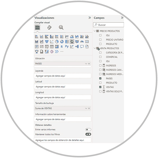
In order to make a map chart in Power BI, we go as we already know, to the visualizations menu, and we will easily find the map chart represented with a globe icon.
Next, we select the fields to represent as in the image that we used in our example to be able to represent the sales made in each Country on the map. And We distribute the fields, as in the image below, in the following way: we will place the "SALES" in Bubble Size, and we will place "COUNTRIES" in Location.
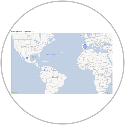
Next, we will see how we have created a graph where we can see sales represented based on where they have been made.
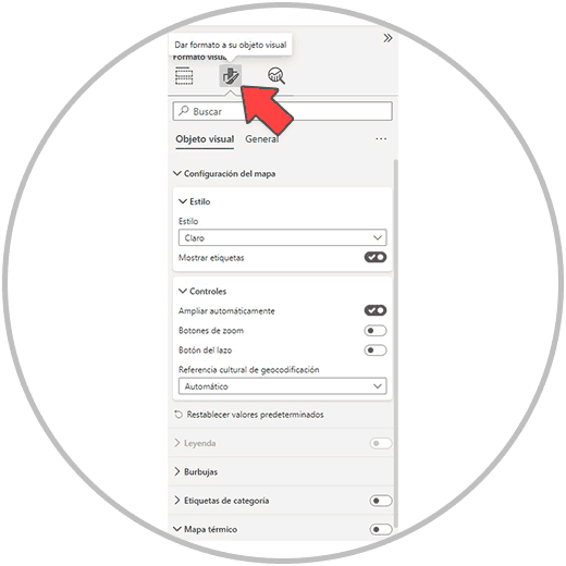
Edit map chart in Power BI
As we have seen before, we can edit the graphic created so that it adapts both in style and in functionality to the final result we are looking for. Each chart type offers its own configuration options. One of the utilities to put a map graphic is to enable the Zoom buttons so that we can zoom in or out of the map.
We can find this option within the graphic format options, which we must have selected, and then we will have to enter, as we already know, the format icon that is in the "Displays" menu itself.
5 How to make a combo chart in Power BI
Another of the interesting graphs that we are going to use in Power BI is the combined graph, in which the values are represented by combining two types of visualizations such as bars and lines. Thus, when analyzing we can differentiate, compare and obtain a trend in our data.
To create a combo chart in Power BI, we go to the visualizations menu and look for the combo chart icon, as in the image below, which we will easily find because it is an icon that shows bars and lines.
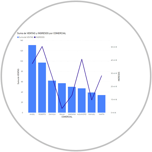
Since a picture says more than a thousand words, we are going to see how to use a combination graph to be able to see the sales and income of all the commercials. So we can see who makes more veins, but also who generates more income; Since in our example the company sells different types of products, with also very different prices, we want to take both metrics into account to find out how sales and income correlate at the commercial level.
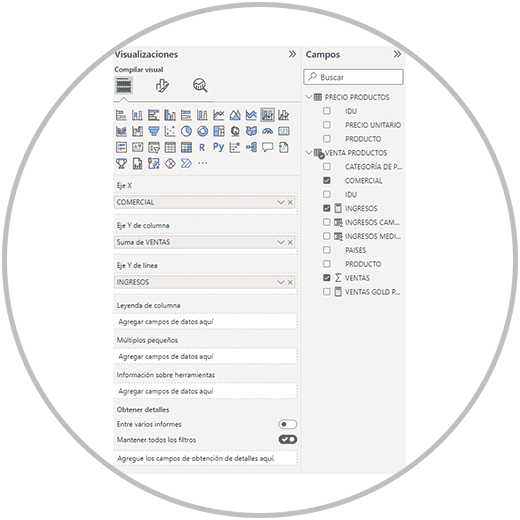
As we will see in the image below, we first select the type of combined graph, then the fields that we want to represent, which are "SALES", "INCOME" and "COMMERCIAL"; And we distribute them in such a way that the "COMMERCIAL" field is on the X Axis, the "SALES" are on the Y Axis of the column, and the "INCOME" is on the Y Axis of the line.
The graph that we see below is the combined graph that is created, in which we can obtain interesting analyzes as we mentioned. Thus, we can see that there are commercials that, despite not being among those that generate the most sales, do stand out in terms of income they generate for the company.
These are just some examples of the options and types of charts that we can do in Power BI. Thus, we will be able to create graphs that are very useful and common such as pie charts, donut charts, or scatter charts.