Data segmentation in Power BI offers us a very dynamic, flexible and personalized experience when we make our reports in Power BI. It offers an interactive experience that will allow you to filter the information according to the need of the moment..
When we talk about "interactive experience" we are talking about the possibility offered by data segmentation to be able to filter the information in our tables and graphs that we do in the visualization or reports phase, when we are in the visualization view in Power BI Desktop.
Data segmentation is the perfect ally of the tables and graphs that we make. On the one hand, for you, for the person in charge of preparing the report, because it avoids having to create a multitude of graphs and tables so that all the important aspects that the data show us can be seen, and therefore it avoids us having to carry out a complex report; For the person with whom you share the reports, it will be very practical so that they can filter and view the data in a personalized way, so that they can interact with the report and see the graphs, tables and the rest of the report elements in a general way yes , but also in a segmented way..
One of the advantages of using the slicer in Power BI is being able to connect all the graphs or visualizations of your report or Dashboard in such a way that every time you perform a filter in the data slicer, all the graphs will change and display the selected view, based on the data you filtered.
Ultimately, data segmentation brings a degree of utility and dynamism to your reports so that it can be customized and adapted to the view you choose. From an analysis point of view, it is a perfect solution that helps you see a set of data, the results in a general way, but thanks to the segmentation you can go deeper or zoom in on that part of the information where it is necessary to enter more in detail.
The segmentation allows you to carry out not one but several important filters, those that are necessary to be able to analyze the information in a general way and in detail according to the need that arises at each moment.
The operation is practically the same as the data segmentation offered by Excel, and the utility is the same as when you make Excel pivot tables.
Power BI, as we are seeing, is a tool that focuses more on the analysis and representation of data, with very useful tools to be able to easily and quickly build a data model that we are going to use in reporting. Speaking of reporting, Power BI is precisely a much more thoughtful tool to be able to create a complete and professional Dashboard that contains data, graphics, maps, markers, cards,....
For this reason, data segmentation turns out to be a very useful resource that you will surely use in all your reports, because as we have seen, it gives you the possibility of being able to filter the information, in the entire set of tables, and graphs of your report. .
Surely, you are already an Excel user and you know the benefits of using data segmentation to build reports, and to analyze information. Whether it is a function that you already knew, or if the concept is completely new, we will explain below how to apply data segmentation in Power BI.
1 How to insert slicer in Power BI
In order to explain data segmentation in Power BI, we are going to work with our fictitious data of a company that sells computer products and peripherals, which has several stores in different countries, where several (commercial) people are responsible for making sales. .
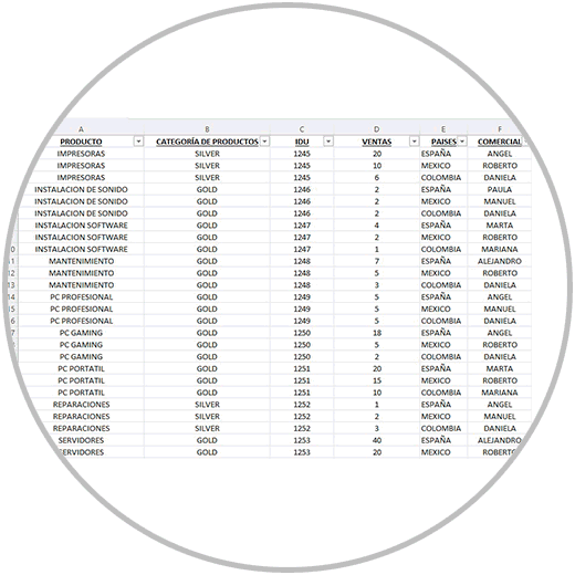
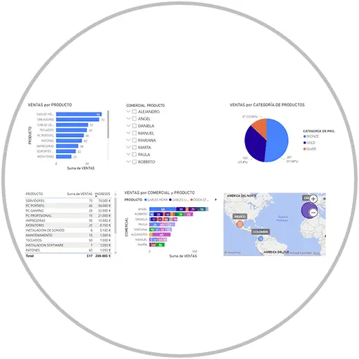
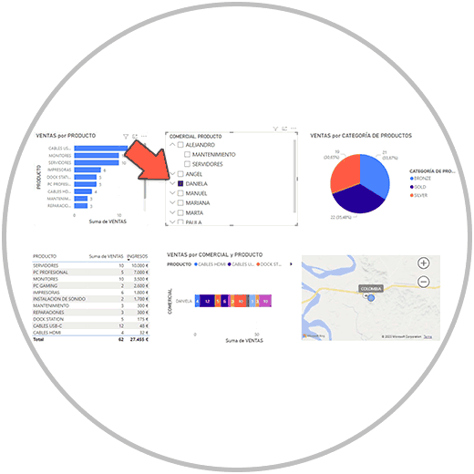
In order to include the data segmentation, we will first make the tables, graphs and the rest of the visualizations that we want to include in our final version of the report. We have created in the example several graphs and tables as you can see in the image below to see later how the information of our entire report is filtered with the data segmentation.
If after doing the data slicer, more visualizations are included, or you decide to do the data segmentation before, we could also do it without problem. But it makes more sense, from a practical and analytical point of view, to include data segmentation when we know what data or criteria we want to include; The criteria by which we want the segmentation to be carried out in the visualizations already made.
If you have doubts about how to make a table in Power BI, or how to make graphics in Power BI, you can review the content already made where we explain it to you step by step.
Remember in any case that, to make a graph, table, any other display option, such as inserting data segmentation in Power BI, are options that you will find within the "Report" view.
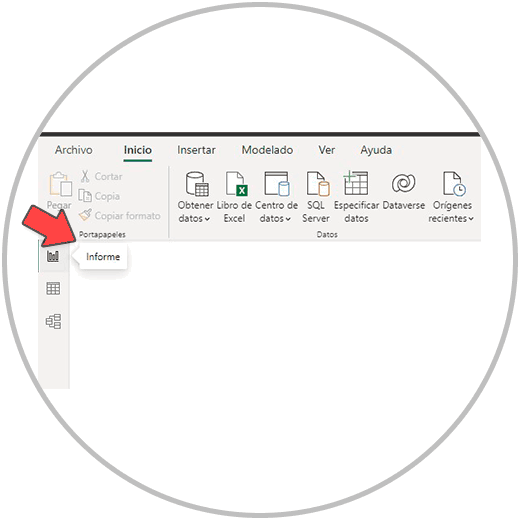
And within the "Report" view, in the "displays" menu.
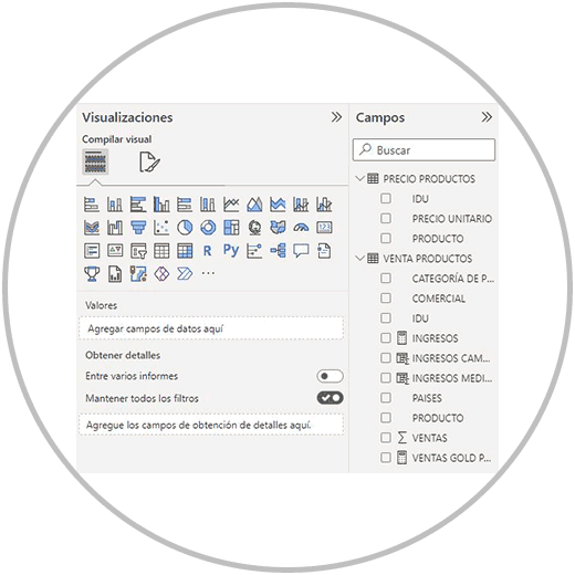
Here as we already know, we have many graphs and visualizations that we can use to represent the data. The data segmentation is also found in the visualizations menu, as you can see in the image below, and we show you with the arrow.
IMAGE 4 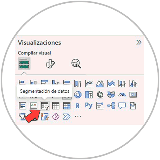
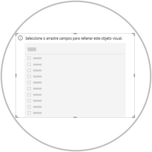
By clicking on the “data segmentation” icon, which you will see represented by a box with a funnel icon, a visual object will be added to our dashboard.
Now, just like we do with tables and charts in Power BI, we are going to select the field or fields that we want to use as criteria to segment the data in our visualizations.
You can make a slicer by combining multiple fields, or you can make several different independent slicers to use in the report.
If we choose to combine several criteria in a data segmentation, you should keep in mind that here the order in which you choose the fields will matter a lot.
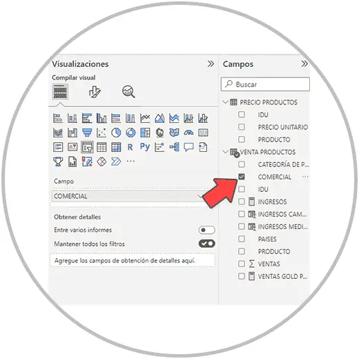
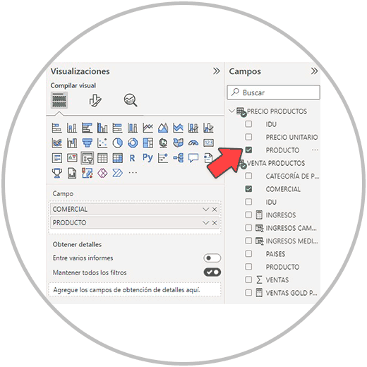
If, for example, we want to add a data segmentation to be able to filter all the views of the report by commercial, and then by product, we will follow this same order when choosing the fields, on the right in the "Fields" menu.
In the example, once the visual objective has been added to our board, we go to the right of our screen, to the "fields" menu and we will first select the "COMMERCIAL" field.
And then we would select the field "PRODUCT"
Once we have selected the fields, we are going to see the data segmentation on our dashboard, just how we wanted to create it, in order to filter the information by salesperson and product.
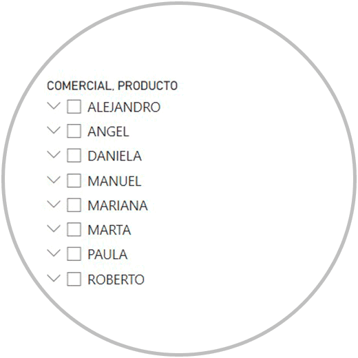
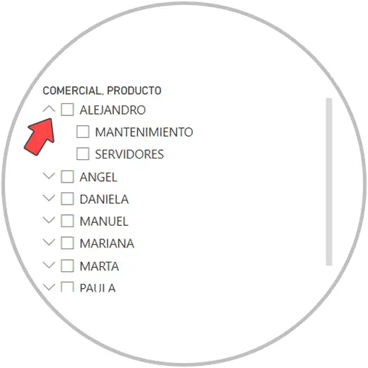
As we can see in the image, all the commercials of the company from all countries appear on the list. Each name has a drop-down arrow in front of it. By clicking on the arrow, for example, on the first of the names, which is Alejandro, we will see how several of the products that the company sells are displayed. Specifically, only the products that this person (Alejandro) has sold will appear in the dropdown.
In the segmentation window that has been added to our dashboard, we will also see a vertical scroll bar, to be able to move vertically between all the records that are within the field chosen in the data segmentation. In the example, we will have to use the vertical bar to be able to see all the commercials of the company.
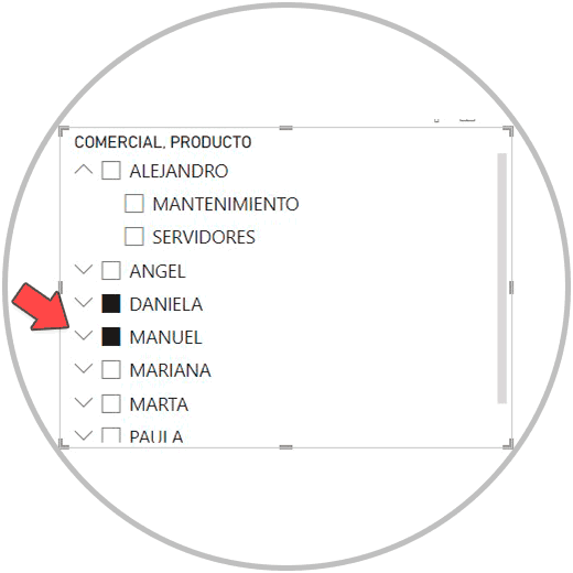
Now, to be able to segment the data, just click on one of the records, in this example case, on one of the business names. When we click, we will see that the box that is just in front of the name is "colored" in dark, and thus we will know that we have the information filtered by this record. In the example we have clicked on the name "DANIELA".
If we look at the graphs, tables, and other visualizations on our dashboard, we can see that the information has been leaked. Now, the tables and graphs only show the activity of this person (Daniela). Thus, we can see the sales made, the income generated, the type of products she has sold, etc. We will be able to see the information that we have represented in the graphs, tables and visualizations that we have created on our dashboard.
Important
In the data segmentation you will see that, by clicking, you can only select a record as filter criteria. In our example, you can see how if we have selected and filtered the information for the commercial "Daniela", when selecting another person the filter for Daniela will automatically be removed and the information for the new person we have selected will be filtered.
However, although it may not seem like it, by default you will be able to select more records in the slicer by pressing Ctrl + click on the new name you want to add to the slicer at the same time.
Thus, for example, if we have our data filtered by "Daniela" by Ctrl + clicking on another person, it will be added to the information that we already had filtered, as in the image below, where we have also selected the commercial "Manuel":
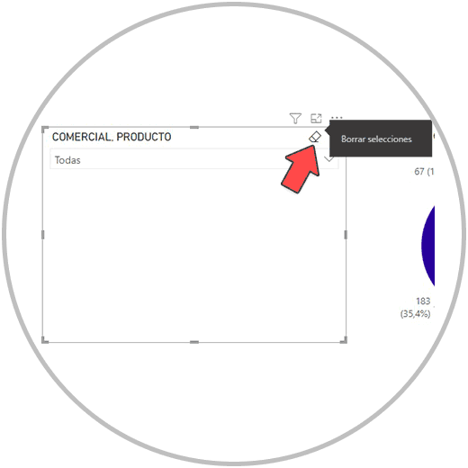
Remove selection in slicer
In order to remove the criteria used to segment the data, we would click on the criteria that we have used for the segmentation. But we could also click on "Clear selections", a small icon that we find in the upper right corner of the data segmentation window.
2 How to edit slicer in Power BI
As we already explained in how to make graphics in Power BI, the visualizations you make for your dashboard can be edited from the "format visual target" option, from the visualizations menu. In the case of data segmentation, we can also make some edits with the options that Power BI offers in this section from which we can make some aesthetic and usability changes.
Each visualization, each type of visualization, offers a series of editions. In the case of data segmentation, in "formatting the visual objective" we are going to find very interesting options to be able to better adapt this utility to our report.
For example, we will be able to completely change the style of the segmentation. By default, the data segmentation initially chooses the style that best suits the field that you have chosen as the criteria for segmentation. However, this style is not always the most appropriate and you can configure it by changing the aesthetics of the visualization completely.
Within "format visual target" we are going to see two types of changes that we can make: "visual target" and "General".
In visual object, we are going to find interesting changes of style. By default, when we created the slicer, a slicer type was automatically created using a list to be able to select at our discretion. However, Power BI offers other styles such as using a mosaic slicer, or a drop-down list. The latter can be used in case of having little space on the board. It is useful because it occupies the space of a bar, and if we need to filter the information, we would click on the drop-down menu and there we would find all the records to be able to select according to the chosen criteria.
We will also be able to make some changes in the data segmentation configuration, such as being able to choose if we want to only be able to make a single selection in the field, or if we want more than one to be able to be selected.
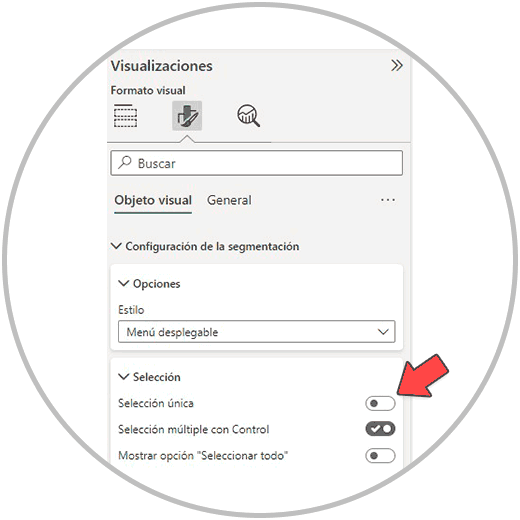
By default, as we have explained to you, by Ctrl + clicking you will be able to select several records within the field that you have chosen as criteria for data segmentation. However, as we have advanced to you, it is something that you can change. We must think about whether this report is for us or whether we are going to share it with other users or people within your team or company. In the case of being a report that you are going to share later, we could decide that we do not want to only be able to make a selection in the data segmentation.
We could also add an option to the chart so we can “select all” within the slicer.
Regarding the aesthetic section, we will be able to make changes in the design of our data segmentation. Changes how:
- Change the style and colors of the slicer window: borders and padding.
Data segmentation, as we have seen, is a very interesting resource inherited from Excel. It will help us so that both we and other users who will have access to the report can filter the information and "zoom" according to the criteria we choose.
Data segmentation provides interaction with the information, and a personalized view that is very useful when it comes to analyzing the information, especially when we want to see data segments, not just the general data.
When making reports or Dashboards, data segmentation will be a key element to include in order to put on the dashboard only the graphs, tables and other visualizations that are necessary, those that show the performance of the important metrics or KPIS to follow. . To be able to go into detail in some of the data fields, or in several, we will use the data segmentation to be able to enter to see data in a segmented way.
Also, as we have seen, we can add several slicer windows, we can even create, as we have seen in the example, a combined slicer using two fields in the same slicer. This will allow us to go into even more detail in the records of a field, using the information of another field. In the example we used this double segmentation to be able to see the performance of the commercials, at the sales level, and to be able to go into detail about the products sold.
Data segmentation is a resource that in the Power BI learning process, we must know to make professional reports that allow interaction to the person who is going to see them. And as we have seen, it is a simple process that, like the tables and graphs, is added to our dashboard as a visual element. In this case, a visual element that will allow us to filter the information in all the tables, graphs and other views of our report.