In order to make a Dashboard in Power BI, we are going to apply the knowledge that we have been acquiring, paying special attention to the most important points when working with this Microsoft business intelligence tool..
It is important that, if we want to learn to use Power BI with ease, in a professional way, we can count on valuable, useful and practical information that allows us to acquire the appropriate knowledge to be able to start safely, knowing in this case which are the phases to follow. which we must pass before giving shape to all the work done previously.
In order to create a Dashboard in Power BI, we can apply the techniques already learned, creating graphs, tables and other visualizations that help interpret the data and make decisions.
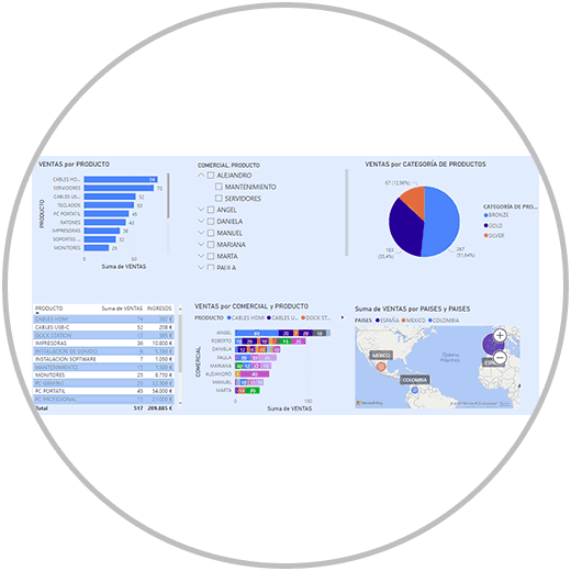
Do you want to make a Dashboard like this?
You only have to follow the steps that we are going to explain to be able to customize your dashboard in a way that helps reading, that fulfills the mission of functioning as a "data translator", where analyzing and drawing important conclusions is an easy task. . It is not about applying complex formats, including an infinite number of graphics, or applying an excess of information, or paying homage to colorimetry..
Making a professional Dashboard that is easy to read can be an easy task if you know some tricks and follow the advice that we are going to provide you.
1 Considerations before creating a Dashboard in Power BI
- Choosing the right information: The first rule to be able to make a professional Dashboard is to understand who that information is going to go to. To whom is this information addressed, and therefore what information should be collected in the Dashboard.
- Choose the appropriate type of graph to represent each metric: Each metric, each information, data or result, must be represented in the way that is best understood, in the visual way that best helps to interpret the result. As we have already seen in how to make charts in Power BI, within the spectrum of visualizations that Power BI offers, we will be able to choose between many options: bar charts, stacked charts, circular charts, cards, combo charts, ... We can say that there is a type of representation suitable for each metric or comparison that we want to include in the Dashboard. In addition, once a graph has been made, we will be able to change the type and see how the visualization changes with the same data, choosing between the different forms of visualization.
- What depth or detail should our Dashboard show? Answering this question to ourselves will help us create a graph that meets the expectations of whoever is going to read it. As we have commented, thinking about who it is for will help us understand what information we should include, how we should represent that information on our Dashboard, how deeply we should display the information. In this sense, as we have already explained in detail what data segmentation is and how to apply it in Power BI, we can use techniques that allow us to filter the information; That allow you to interact with the report by filtering the information in the fields. This is something we can do and should include with Power BI slicer. In this way we avoid having to include many visualizations in the Dashboard.
Important
One of the great utilities of Power BI is data segmentation, and the ease with which we can make graphs and tables and other visualizations in a matter of seconds. We must bear in mind that data segmentation is important as we have already explained in order to see detailed or segmented information.
But there is also another way to be able to apply filters in our reports, to be able to see segmented information without resorting to data segmentation. As? If you haven't noticed yet, the graphs, or tables that we have created and added to our dashboard, are in themselves a powerful resource to be able to perform data segmentation in all the graphs. Best of all, you don't have to do anything, nor change the configuration of your graph.
When you make a graph or a table, by clicking on the graph on one of the values or records of some of your fields, you will see that automatically all the information from all the visualizations of your dashboard is filtered in the graphs..
Thus, for example, if in the example we are working on, we click on one of the commercial people who work for the company, for example, Ángel, in the graph where we see commercial sales by commercial, we will automatically see all the graphs of the dashboard will be filtered to show only activity that concerns this person. (In the example Angel)
- Dashboard style and design. The Dashboard must breathe an elegant aesthetic, but not overloaded, we must create a Dashboard that contains a common style that is reflected in all visualizations. We can create Dashboards with another philosophy, but what we want to build is a report that we want to see, analyze, and interact with. In this sense, it helps a lot to make the visualizations using the same style criteria, and that it goes in line with the background.
- Flexible dashboard. Each situation will require a Dashboard, and different graphics and visualizations. For this reason, we must learn that each Dashboard must be adapted to each situation, and not the other way around. We cannot always use the same scheme, with the same graphs. Remember that each metric will be better represented with the graph that best represents it. As we have commented, making a view on YouTube hardly takes time, and as we will see below, adapting the style, or creating a style, will not take very long either.
- Dashboards always updated: your Dashboard should always contain the most up-to-date information. It is as important that the Dashboards have all the important metrics, as well as that these values are updated. Always, as we say, thinking about who is going to use the Dashboard, who is going to read and analyze it, and for what purpose.
- A Dashboard forever: Although we can make updates, if necessary, if we have to include new metrics in the report, we must think that the Dashboard that we are going to build will be used as the reporting reference from now on. That is why we always insist that ensuring the veracity of the data should be an absolute priority when we work in Power BI. Once the report, or Dashboard, is created, we will only do maintenance work, review. Unlike a report built on a simple Excel sheet, or in other tools, your reports in Power BI will be created, fed and updated practically automatically. Once the Dashboard, the design, the visualizations have been created, we will not have to spend more time on these details.
2 Why make a Dashboard in Power BI?
A Dashboard will contribute to your project, or to your day to day, a professional solution to the treatment of data with an analytical purpose, to draw conclusions, and to approach decision-making successfully. Many users, professionals, people who work with data, are accustomed to working in a much simpler format. Working in Excel early in the process is very helpful. As we already saw in the Excel Pivot Tables course, we can also go to the next level if we want to squeeze the Excel options to be able to automate, avoid typical errors, and provide a professional solution.
Power BI works in this line, and as we have seen it will help us to create a data model with connected data tables, perform quick calculations with the measures and calculated fields, and create tables and graphs and other visual elements with a friendly interface. , simple and intuitive. Creating a Dashboard will help us in many ways, and it will help us focus on the relevant metrics or KPIs. Let's see the results, and see the evolution over time.
- Representation of the data, monitor, track the data: Dashboards in Power BI give us the possibility, as we have seen, of being able to visualize data in a simple and concrete way, using the available elements such as graphics, tables, cards or the maps. A Dashboard helps you understand the data, identify trends (positive and negative), face metrics, and establish benchmarks that are important for analysis. It helps us monitor the data as often as we want, keep track of important metrics, and thus detect not only trends, but also problems or drops in any of our target metrics to follow.
- Reports in Power BI are also created only once. It is not just a template that we use to be able to enter the data with a certain frequency. The Dashboards in Power BI are created once. Afterwards, our job will be to update the information and especially review the data that is added to the data source. But not having to create a new Dashboard every week.
- The Dashboard is a report with automation mechanisms . We don't have to create one every week, we don't have to drag formulas, or change formulas in operations.
- Real-time data analysis – With Power BI, keeping data up to date is not a problem as it allows you to connect to the source and update the data, even schedule regular updates.
- Dashboard, an updateable report . We can automatically update the Dashboard as we will explain. Or we can do it manually. But at any time, we can also update the visualizations that we show, remove, add or make aesthetic changes at our whim or need. The important thing, as we always say, is to ensure the veracity of the data, that our data model is valid, that our data tables are connected to each other.
- Real-time data analysis: With Power BI, keeping the data up to date is not a problem as it allows you to connect to the source of origin and update the data, even schedule periodic updates.
- Interaction in Dashboards : Dashboards in Power BI are interactive by nature, as we have explained to you, because each graph is a "segmenter" of the information. But we also have data segmentation that allows us to include a visual element on our dashboard, or several, to be able to filter the information with the criteria we choose, as we already explained in how to do data segmentation in Power BI. In this way, other users who have access to the Dashboard can perform personalized analysis by filtering the data, ordering the different visual elements.
- Personalization and flexibility: Dashboards in Power BI can be customized to suit the needs and preferences of users. You can design the look, layout and interactions of the visual elements according to your requirements and priorities.
- Collaborative mode: With Power BI, as we will see, we can share our Dashboards and reports so that other users can consume them. They allow you to collaborate in real time, comment and analyze together, for example, if this work should be done in groups in an organization.
3 How to make a Dashboard in Power BI
In order to create a Dashboard, therefore, we must make sure that we are working with the correct data, that the data is true and up-to-date. Although we already know what are the previous steps that we must go through before reaching the reporting or visualization phase, in the image below we are going to do a quick review of the most important points that we must undertake before filling the board with visualizations and visual elements.
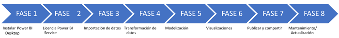
Remember
- Import the data or connect Power BI Desktop with the source data.
- Review the data, the standardization of formats, review possible errors before importing them, and in the transformation of the data.
- Remember to make a valid data model with connected tables. The relationship between the tables will be a "must" to be able to squeeze all the functions of Power BI, to be able to do operations between columns that are in different tables.
- Also remember that measures are a very professional way of working in Power BI to be able to do calculations. Also the calculated columns can provide utility in the process when you want to do operations, but remember to use the measures whenever possible.
- Measurements work with the Dax languages; If at any time you encounter difficulty when creating a formula, remember that as we explained in how to create any formula in Power BI, you can create custom formulas very easily by following the steps explained.
Once you have all the previous steps done, you can go to the "reports" view, within Power BI Desktop and start representing the data, using the tables, graphs, data segmentation, maps, cards and the rest of the objectives visuals you can use in Power BI.
To make a Dashboard, we are going to use our example. We have the data of a company that sells computer products, with representation in several countries, where we have the information broken down by business, and also by product.
What visual elements do we want to add to analyze the results?
- We want to add a table where you can see the results by product. We also added a table where you can see the sum of sales and income per product sold.
- We want to add a graph that represents the total sales of products sold.
- We want to break down the information by commercial and include it in a combo graph so that you can also see which products each commercial sells the most.
- We want to include a pie chart where we can see how the sales distribution is according to the product category.
- Finally, we want to add a map to visually see the countries where we have sales, and also see the importance of each country according to the sales that have been achieved in each geographical area.
4 How to make a data table in Power BI
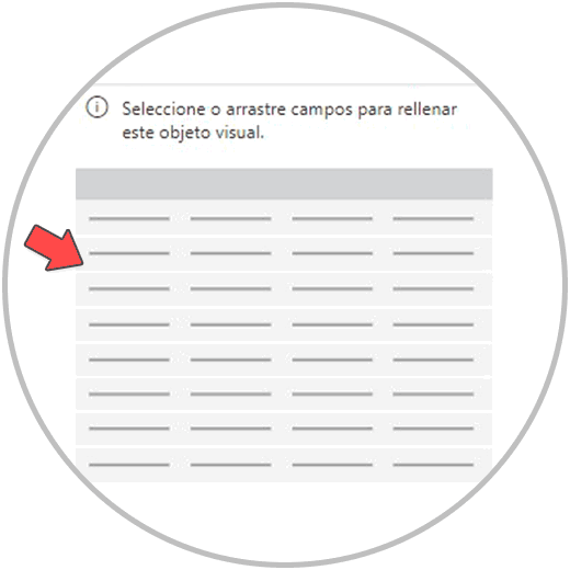
We'll start by first creating the table in the report. We are going to go to the reports view, from the left side of our screen, as in the image.

Once inside reports in Power BI Desktop, we go to the right side of our screen, where the "Visualizations" and "Fields" are located, which we are going to use to build our tables and reports.
Now to make the table in Power BI, we look for the table icon and click, as in the image, on the visualization menu.
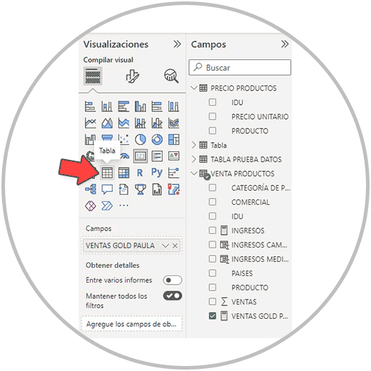
Now, we will see that an empty table has been created on the board, and that it will be completed later when we select the fields that we want to put in the table.
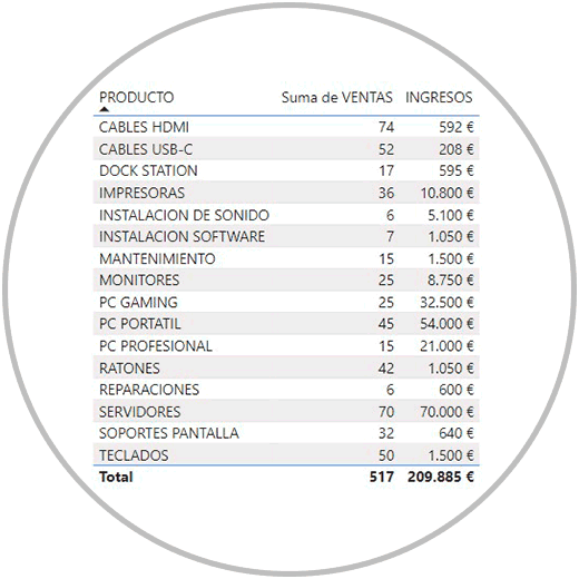
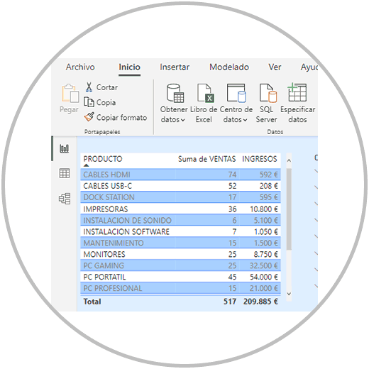
We then select the fields that we want to represent in the table. As in the image that you will see below, we select the fields "product", "sales", and "income".

After selecting the fields, we are going to see the data table with the information on product sales, as well as the income generated.
5 How to create charts in Power BI
Once the table is generated, we begin to create the graphs. We are going to create various types of graphs to represent different but important information, looking in each case for the graph that best represents the information we want to show.
Bar graphic
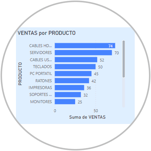
We are going to start creating the first of our graphs. It will be a simple graph where we can see the sales by products. For them we are going to create a horizontal bar graph.
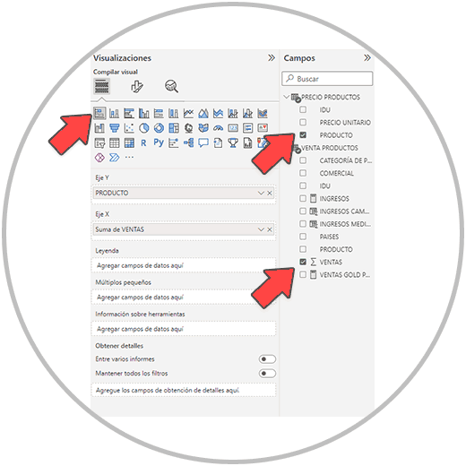
To create a horizontal bar chart we are going to go to the Power BI visualizations menu, we are going to first select the type of chart we want in the menu, and then we will select the fields.
Look in the image below which chart we have selected (Stacked Bar Chart), which fields we have chosen (“PRODUCT” and “SALES”), and how we have placed them on the X and Y Axes.
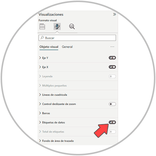
Remember that if you want to add the data label to the chart, you can activate the option in the "Format your visual object" menu.
The graph we have built looks like this:
stacked bar chart
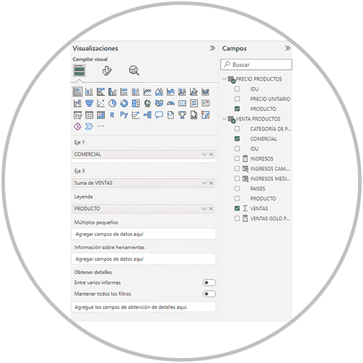
Next, we are going to create another bar graph, but adding more information. On the one hand, we want to make a graph to show the sales of each commercial, but we also want within the graph to see what products each commercial has sold.
To create this chart, as we already know, we go to the visualizations menu, within the reports view, and we are going to select the type of chart we want and the fields we want to represent. In the image we can see how we have placed the fields in the different Axes and legend.
Pie chart
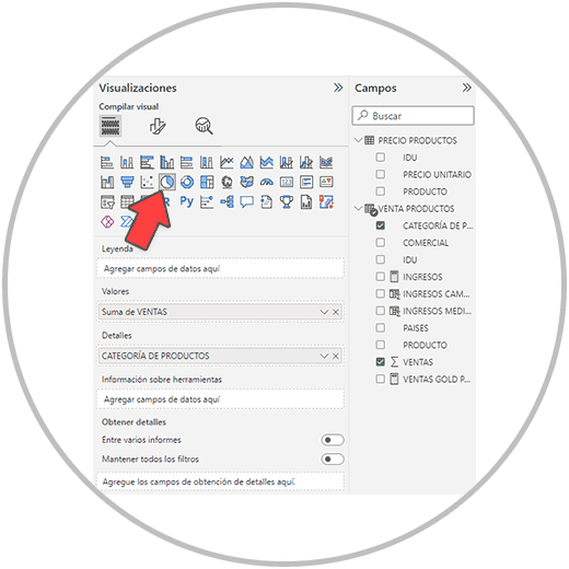
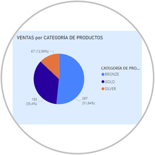
Now we are going to create a circular graph commonly called a pie chart, to be able to see in a simple graph how all sales are distributed, according to their product category. We have 3 product categories (Gold, Bronze and Silver). We want to see the sales for each category, as represented on a pie chart, and what percentage of the sales is allocated to each category.
To make this graph, we have to select the type of pie chart, as in the image below, select the fields "PRODUCT CATEGORY" AND "SALES", and distribute them like this in values and details:
By laying out the chart this way, this is what we're going to get:
Remember
If you want to make another type of chart, or you want, for example, to make a combined chart on two axes, we explain everything in detail in how to make charts in Power BI.
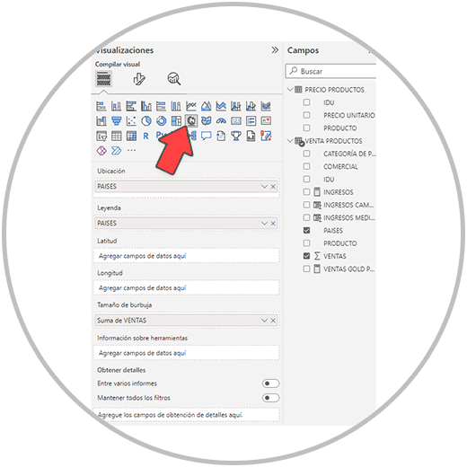
Map chart in Power BI
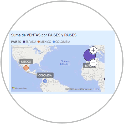
We are going to use the map graphic to add a map to the Dashboard that represents the geographical areas where sales are made, representing with a "Ball" the countries where sales have occurred. In addition, we want the size of the ball to be proportional to the sales that each one makes.
To make the map chart in Power BI, and add it to our Dashboard, we go to the visualizations menu and look for the map chart. Next, we would select the fields that we want to represent on the map: “COUNTRIES” and “SALES”.
Therefore, a map graph would be created according to the fields that we have selected, with the configurations that we have selected.
Add slicer
As we have seen, the charts and tables themselves are “slicer” elements in Power BI. To give your Dashboard a more professional and useful look, we can add data segmentation to our Dashboard. We are going to use the data segmentation in this example to be able to filter all the elements of the Dashboard by commercial.
To add data segmentation to our Dashboards, we are going to follow the following steps.
To perform the data segmentation in Power BI, as well as to create any table, graph, or other visualization options, we have to go to the "Report" view.
And within the "Report" view, we will find all the visualization options, including data segmentation, in the "visualizations" menu, as you can see in the image:
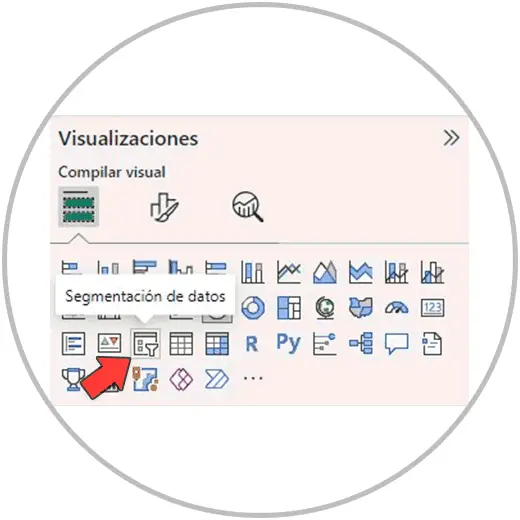
When we click on the "data segmentation" icon, the visual element will be added to our Dashboard, empty at the moment since we have not yet selected the field that we want to use as segmentation criteria.
Now then we will select the field or fields that we want to use as criteria to segment the data in our visualizations.
Remember
It is possible to do data segmentation with several criteria, combining several fields in the same data segmentation that we are going to use.
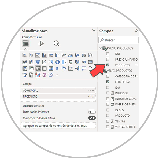
We are going to add a data segmentation to our Dashboard to be able to filter all the information by commercial, and then by product,
Continuing with our report, once we have added the segmentation visual element to our report, we go to the right to be able to select the fields that we are going to use as segmentation criteria: "COMMERCIAL" and "PRODUCT".
Now we are going to see on our board the data segmentation that we can use to filter the results by commercial and by product.
As we can see in the image below are the names of all the commercials, and to the left of the name, we will see an arrow that, when clicked, displays the products that each person has sold.
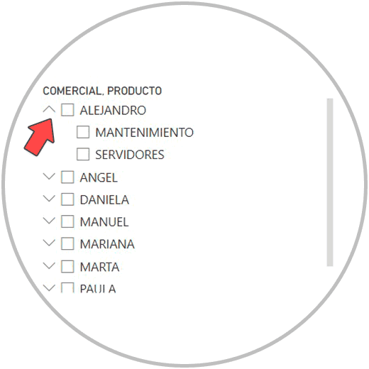
In the visual element that has already been created in our Dashboard, on the dashboard, we will see a vertical scroll bar that we can use to see the records of the chosen field. To segment the data, we click on the name of one or more commercials, and we can click on the products if we want to see the information by commercial and product.
Remember
We can choose several records in the data segmentation by doing Ctrl + Click. If we use only the mouse, it will let us choose only one record, but we can use the Ctrl key to be able to add more records to our slicer.
Dashboard Design
Once we have made the data tables, graphs, maps, data segmentation, etc. We can now enter the aesthetic section.
In order to aesthetically configure the tables, graphs, etc., we can enter the "format your visual object" section, within the visualizations menu.
If we have selected a visual element, by accessing "format your visual object" we can aesthetically configure the chosen element.
If we do not have any visual element chosen from the board, we can also configure the background or board of the Dashboard from the same menu.
6 Tips for designing a Dashboard
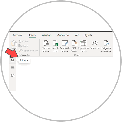
In order to create a Dashboard faster, we can use the "copy format", an option that we will see in the reports view, in the Start menu.
We would format one of our visuals, and then we'll copy the formatting and apply it to the rest of the visuals.
In order to make a more minimalist design that helps the interpretation of the data, it is advisable not to use many colors. Something that we can apply to our Dashboards in this case would be to choose the same background or wallpaper color for both the visual elements and the page format. We can use white, which will always provide a clean view, or we can apply a color in light tones. The Dashboard can wear the colors however you choose, and can be adapted to the corporate colors of your company, team or organization.
From the format options, you will find many options that will allow you to give the "look & feel" that makes your Dashboard look better.
You will be able to configure whether or not you want to put the legend on the graphs, put or remove the information on the Axes, you can add a slider, to be able to zoom, add or remove labels, or set the background of the plot area as you want . You can of course configure the colors of the graphs, add or remove the data label as we have already seen, add or remove the title in each visualization, etc.
As we have already seen, since the aesthetic section is a very important part that the work done should show off, the most important thing when making the Dashboard is that:
- The data displayed is correct.
- That you represent all the important metrics or relevant KPIs.
- That you choose the appropriate graphic at each moment that best represents the field or fields that you are going to represent. Remember that, if it is a question of making a graph with perspective in time, it will help if you represent this data in a line graph, or in a combo graph.
- Use combo charts to be able to compare different metrics on the same chart.
- Use data segmentation to be able to Zoom in on those fields that you think are necessary due to their importance, in order to see the relevant data in detail.